Davis Farmer’s Market
Community Event Poster
Community Event Poster
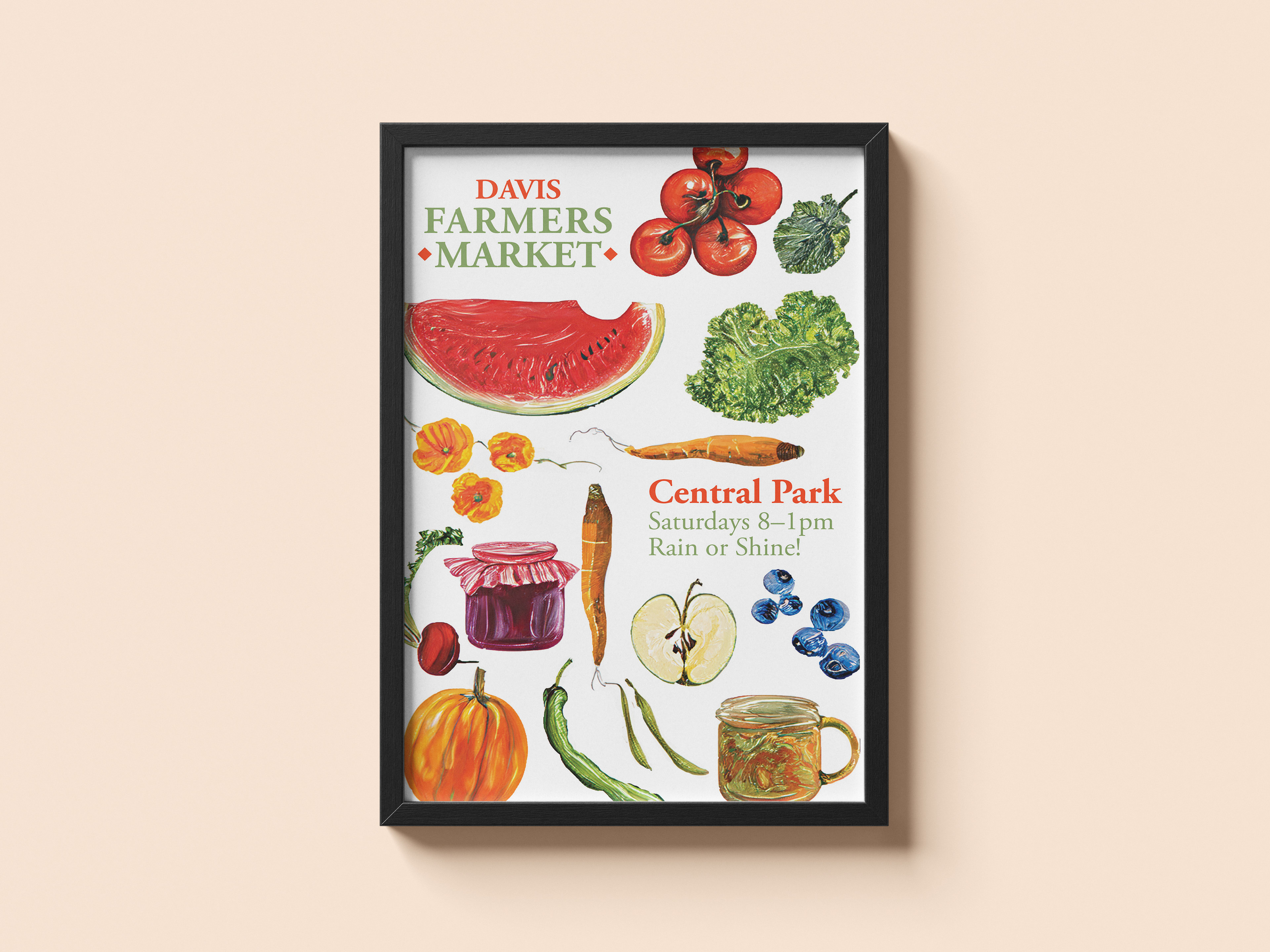
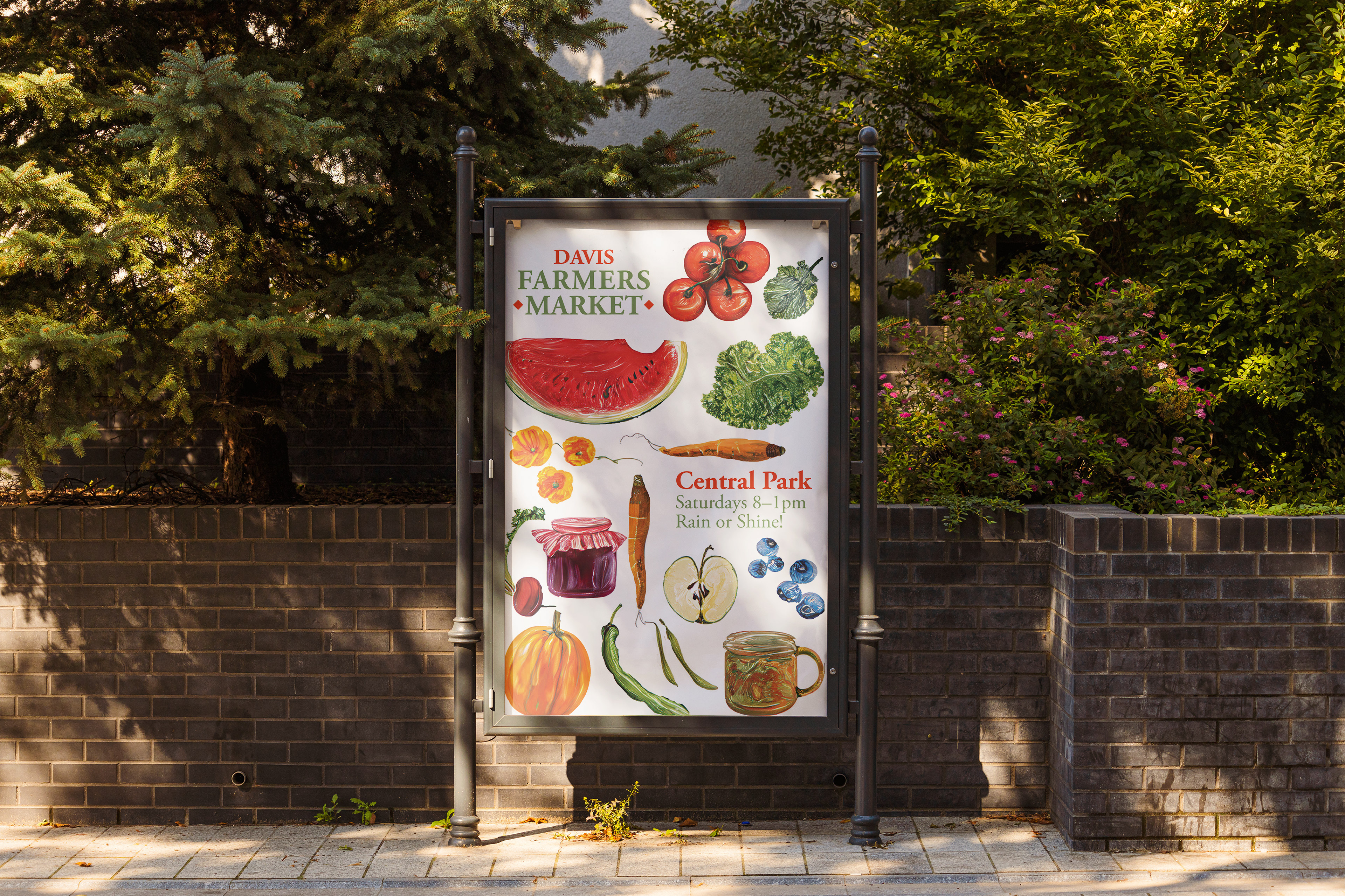
Davis Farmers Market is an event poster designed to promote one of Davis's longest-running community traditions while working within its established visual identity. The project challenged me to research an existing organization, understand its audience and values, and translate those qualities into a new piece of visual communication.
The final design draws from the market's recognizable warm colors, organic imagery, typography, and community-focused personality while introducing my own visual approach. As part of the assignment, I was also challenged to experiment with an unfamiliar design technique, leading me to explore Adobe Photoshop's generative tools as part of the image-development process.
Context
Designing for a Davis Tradition
Founded in 1976, the Davis Farmers Market has developed a recognizable identity centered around local agriculture, sustainability, and community connection. Before beginning the poster, I researched the market's history, mission, audience, existing visual language, and the experiences it offers beyond produce.
My research showed that the market needed to speak to a broad local audience, from families and UC Davis students to sustainability-minded residents and regional visitors, while maintaining the welcoming, homegrown character that makes it distinctly Davis.
Reading the Existing Brand
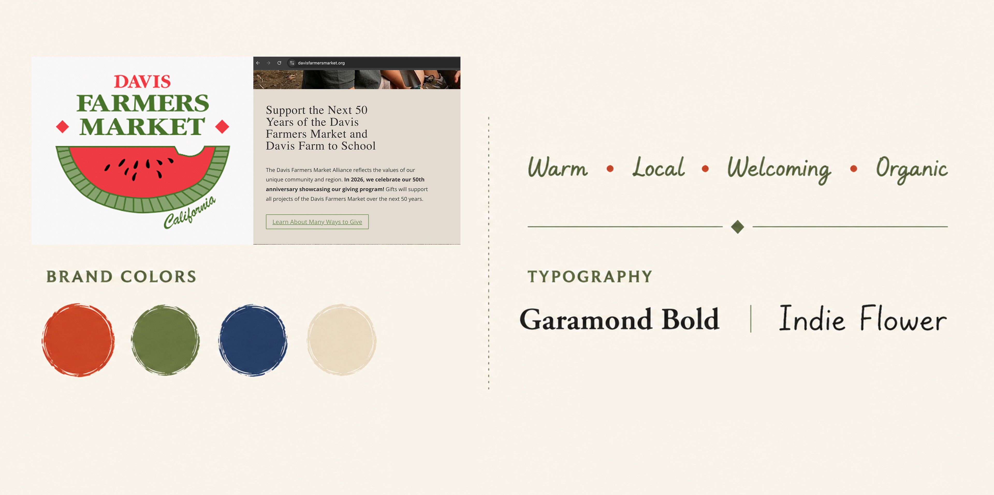
Rather than creating a new identity, I looked for visual cues I could carry into my own design. The market's watermelon logo, warm greens and reds, organic imagery, and combination of traditional and handwritten typography gave me a foundation for creating something new that could still feel recognizable.
Challenge
How can I introduce something visually new while still making it feel like it belongs to an established brand?
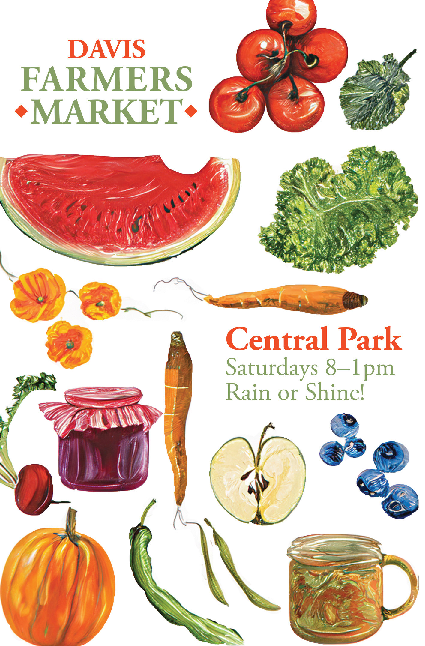
The challenge was to create a poster that felt unmistakably connected to the Davis Farmers Market without simply reproducing its existing materials. I needed to balance recognizable brand elements with a new visual direction while keeping event information clear and approachable.
At the same time, the assignment asked me to work with a technique I had not previously used. I chose to experiment with Adobe Photoshop's generative AI tools, exploring whether they could help me develop imagery that felt more painterly and handmade while still giving me control over the final composition.
Design process
Finding the Visual Direction
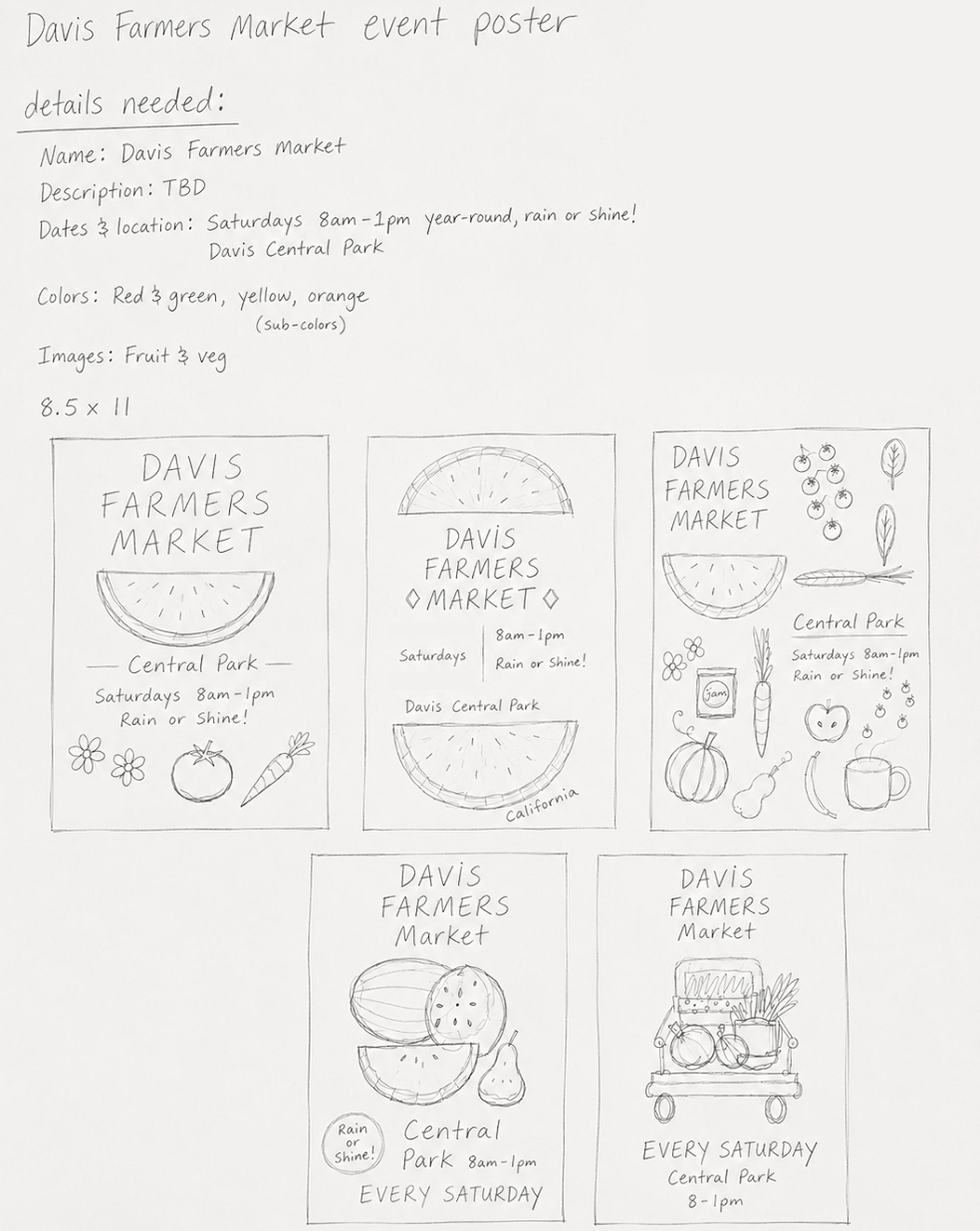
I began with sketches exploring composition, hierarchy, imagery, and different ways the market's existing identity could influence the poster. Because the brand already had a strong visual personality, I focused on finding a balance between familiarity and creating something distinct enough to stand on its own.
Experimenting With Generative Imagery
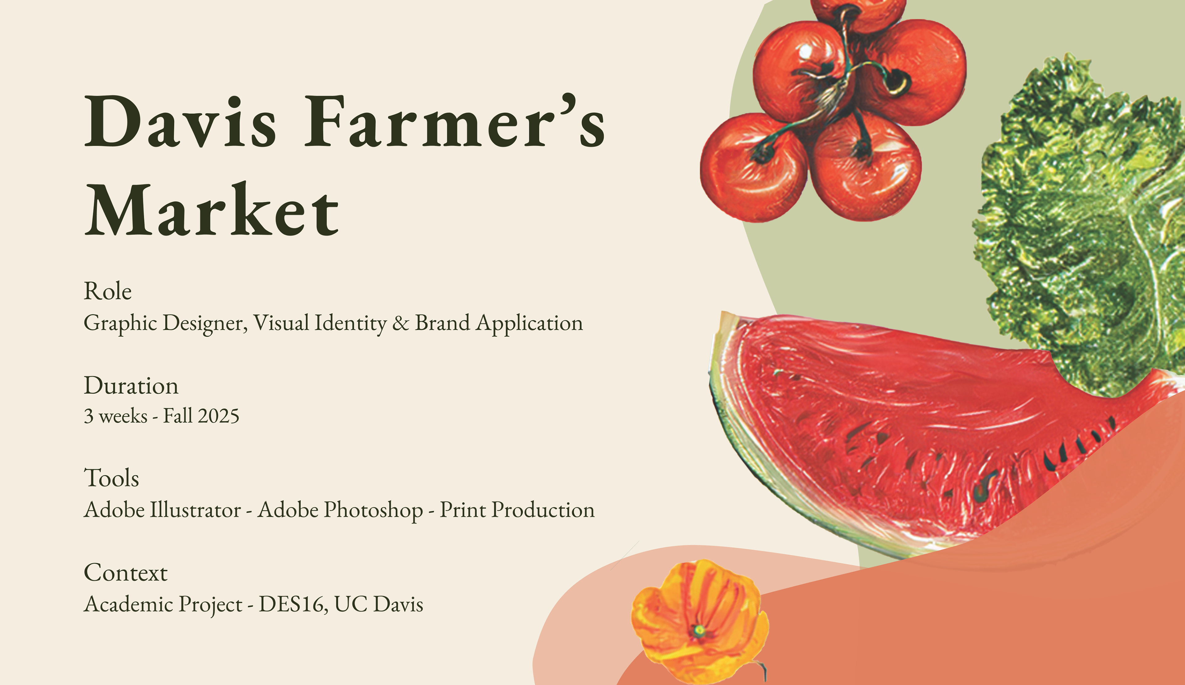
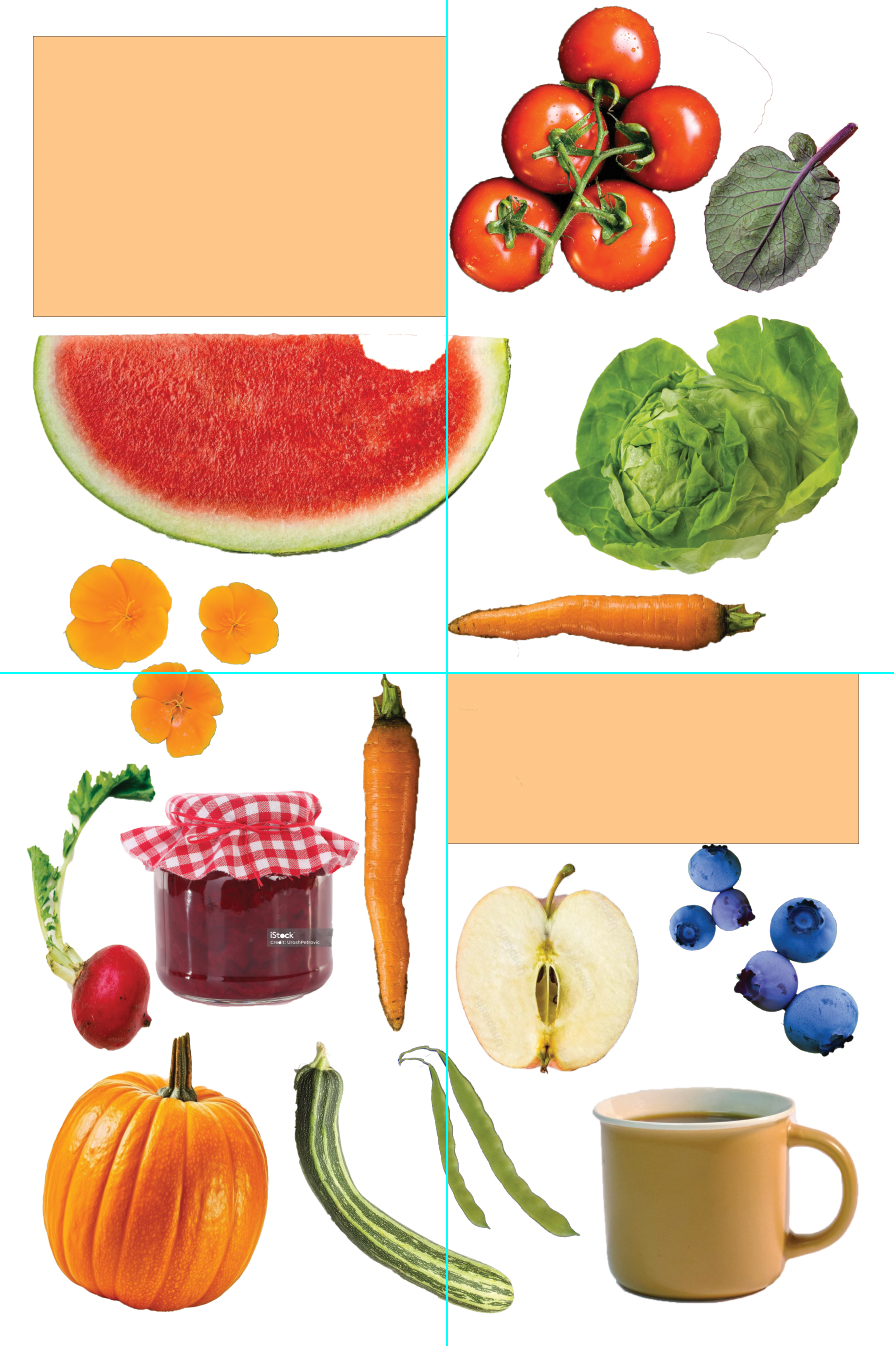
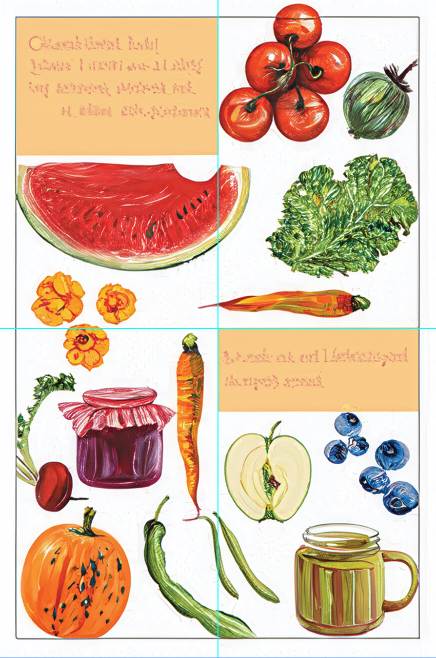
Rather than treating generative AI as a way to produce the finished design, I used Photoshop's generative tools as part of an image-development process. I began with fruit and vegetable source imagery and experimented with transforming it toward the softer, painted quality I wanted for the poster.
The generated results became material to evaluate, edit, arrange, and integrate into the larger composition. With the role of AI in design still evolving, this project gave me an opportunity to approach an unfamiliar technology with curiosity while thinking critically about where it could, and couldn't, fit within my process.
Design tools have always changed, and I believe part of growing as a designer is learning how to adapt to new tools without losing the intention, decision-making, and humanity behind the work.
Outcomes
Designing With Direction
Throughout the project, my professor acted as a design director, providing feedback as I developed and refined the poster. This helped me evaluate whether my experimentation still felt connected to the Davis Farmers Market identity while keeping the information clear and approachable.
For the final critique, I presented the poster and supporting research to my classmates as mock stakeholders, explaining and defending decisions around audience, typography, imagery, branding, and composition. Having to articulate the reasoning behind the design encouraged me to evaluate the poster not only by how it looked, but by how effectively it represented the organization.
Rooted in the Existing Brand
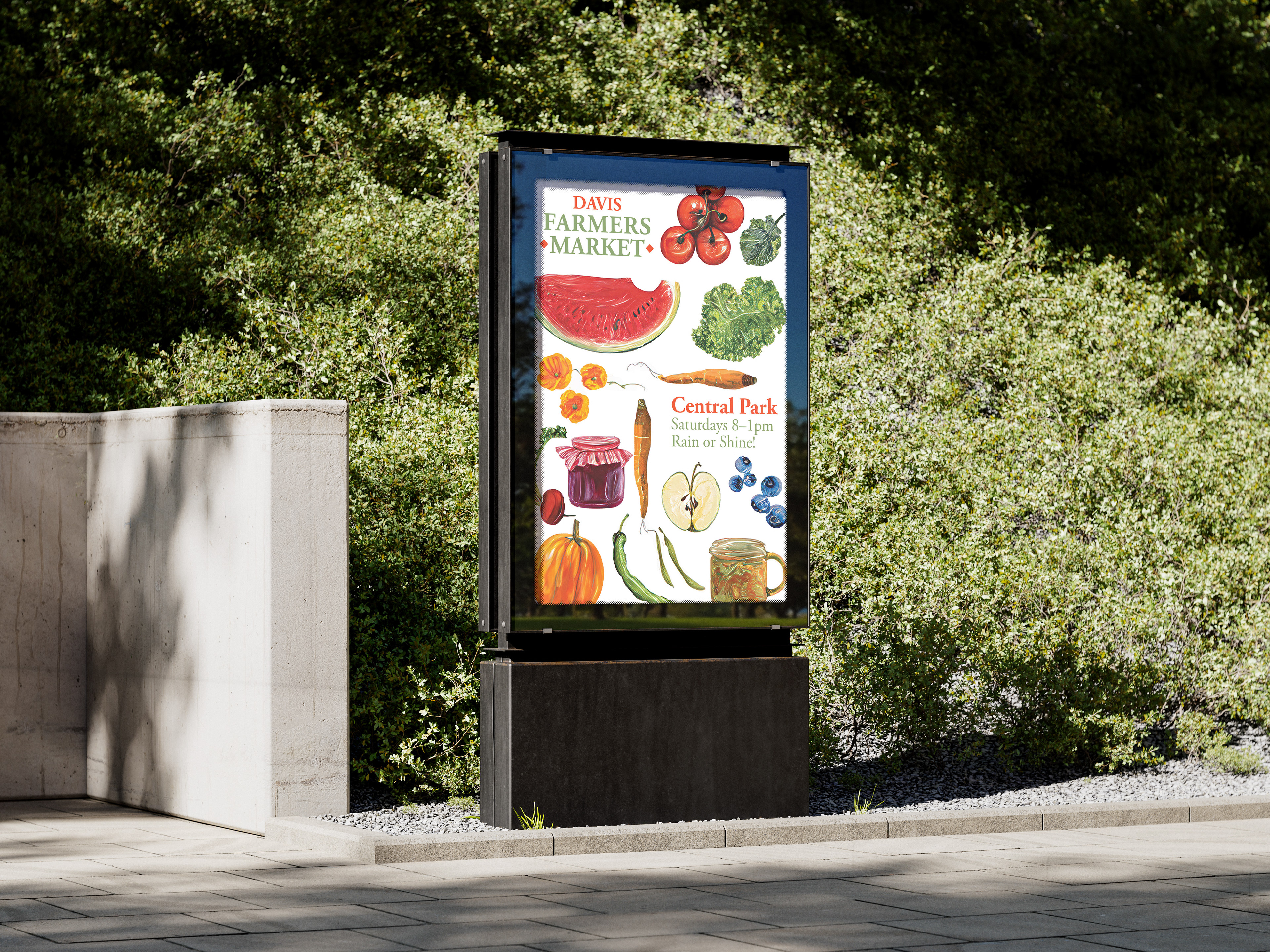
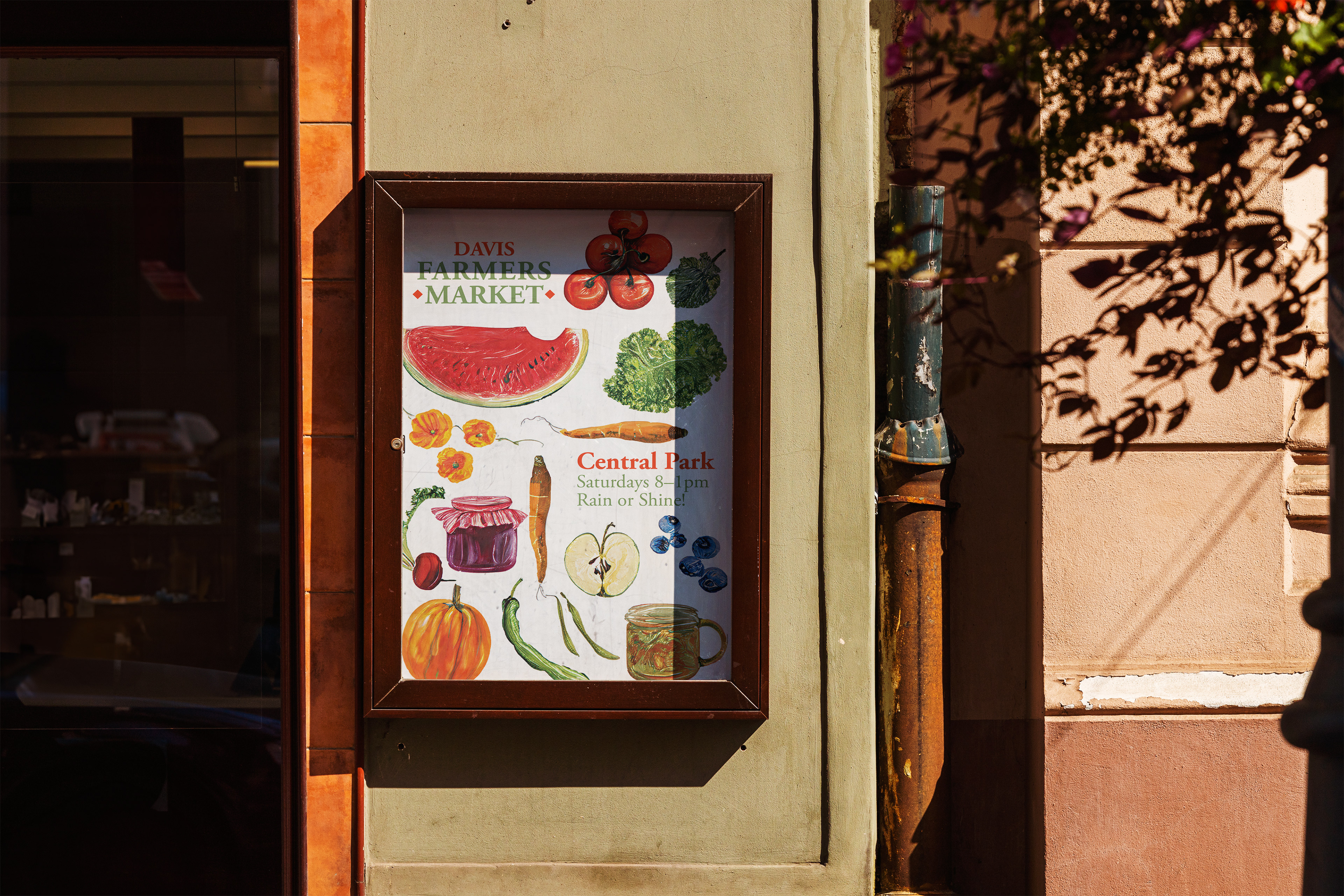
The final poster combines the Davis Farmers Market's established visual language with a new image-making approach. Warm colors, organic forms, familiar typography, and produce imagery connect it to the existing identity, while the painted imagery gives the poster its own personality.
Takeaways
Designing for a Brand That Already Exists
This project taught me that designing within an established identity requires a different kind of creativity than building one from scratch. Instead of deciding every element freely, I had to identify which parts of the Davis Farmers Market's visual language made it recognizable and determine where there was room for my own interpretation.
Researching its audience, typography, values, and existing materials made my design decisions feel much more intentional and gave me a better understanding of how individual pieces can contribute to a larger brand system.
Experimenting With New Tools
Working with Photoshop's generative tools also gave me an opportunity to experiment with a technology I had never incorporated into my process before. I learned that the most useful part wasn't simply generating an image, but directing, evaluating, and refining the results until they supported the larger visual concept. It reinforced the importance of treating new tools as part of a design process rather than allowing the tool itself to determine the outcome.
Pushing It Further
With more time, I would have loved to expand the poster into a small campaign system, exploring how the visual direction could translate across social media, signage, event materials, and seasonal variations while remaining consistent with the existing Davis Farmers Market identity.
I would also be interested in revisiting the generative image-making process behind the poster. Adobe’s generative tools, along with generative AI more broadly, have evolved significantly since I completed this project. Returning to the same concept with newer tools would give me an opportunity to explore how much more control, consistency, and intention I could bring to the imagery while continuing to treat AI as a tool within the design process rather than a replacement for it.