Nature for
the City
the City
Responsive Nonprofit Website Concept
Nature for the City is a responsive nonprofit website concept designed to connect Gen X, low-income urban residents with an interest in nature to accessible green spaces, resources, and opportunities within their communities. By bringing people together through a shared interest in nature, the organization also aims to help older adults build community and create meaningful social connections. The concept was developed in response to an assignment focused on researching and designing for an audience outside of my own experiences
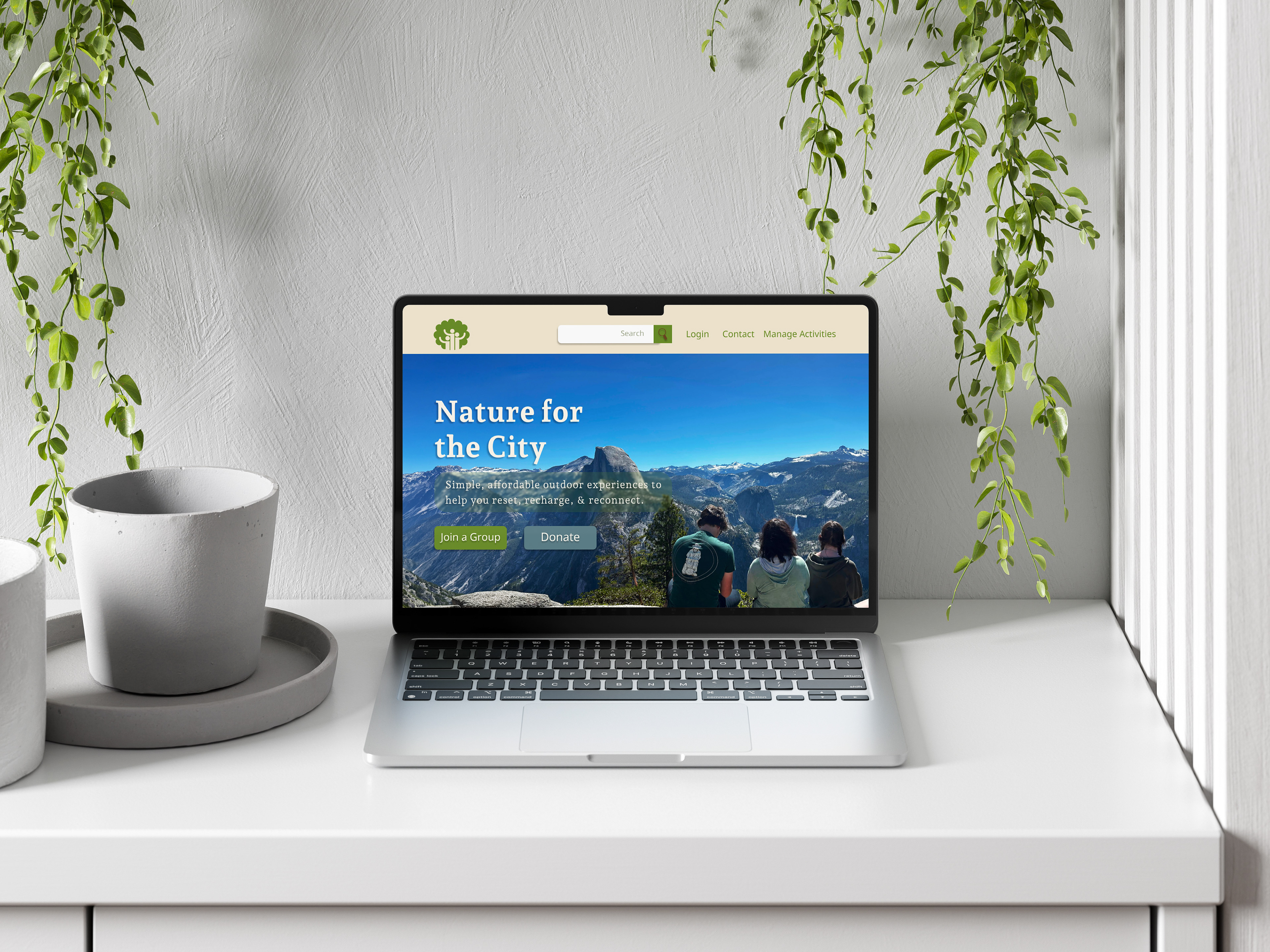
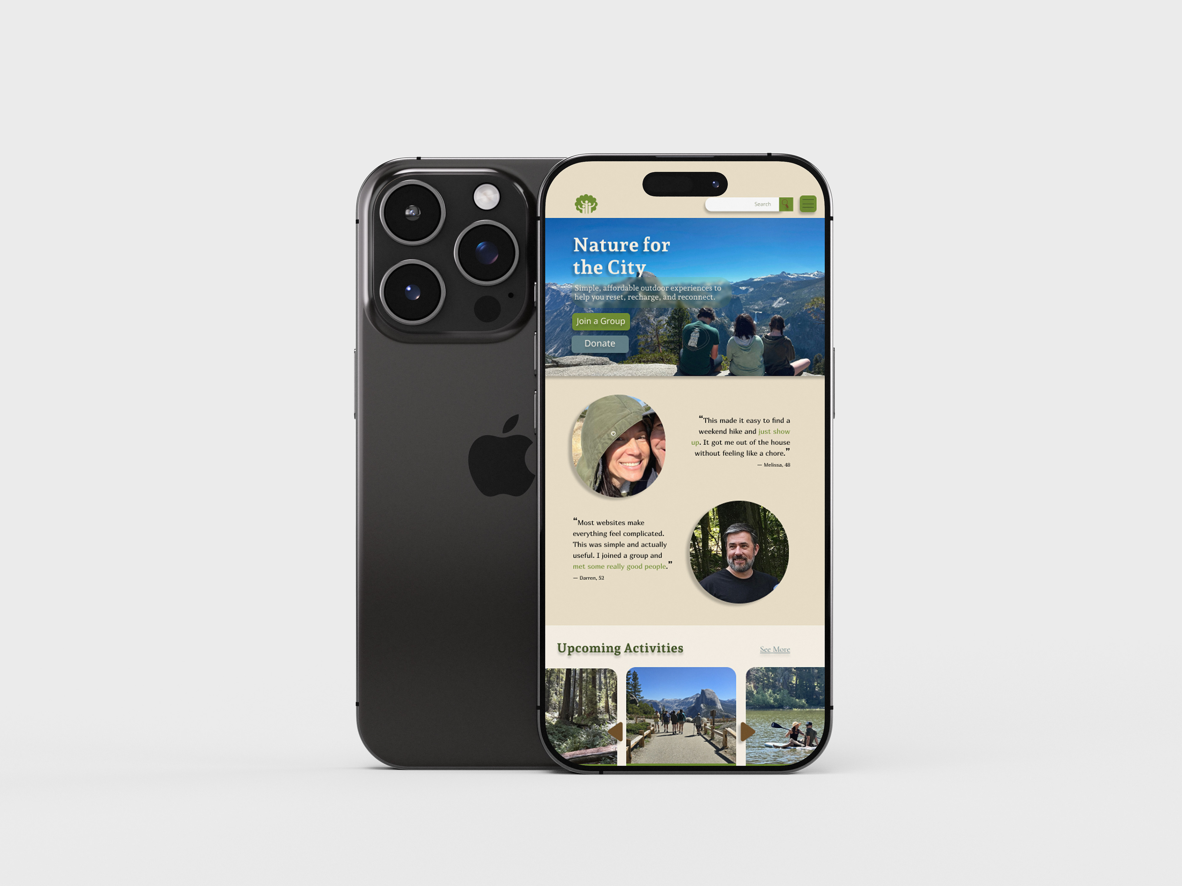
Designed across desktop and mobile layouts, the website balances informational content with clear pathways for users to learn about the organization and engage with its work.
Context
Designing for a mission
Nonprofit websites have to communicate a lot at once: who an organization is, why its work matters, and how someone can get involved. For Nature for the City, I needed to translate an environmental mission into a responsive experience that felt welcoming and informative while making important resources and opportunities easy to find.
The challenge was to balance the organization's visual identity with the practical needs and a deep understanding of its audience.
Understanding an Unfamiliar Audience
Rather than choosing my own target audience, I was assigned Gen X, low-income urban residents with an interest in nature, a group intentionally outside of my own experiences and style preferences. I began by researching their needs, behaviors, priorities, and potential barriers to determine what kind of organization and digital experience could meaningfully serve them.
That research ultimately shaped both the concept of Nature for the City and my design decisions, particularly around clear information hierarchy, straightforward navigation, prominent calls to action, readability, and responsive access across desktop and mobile.
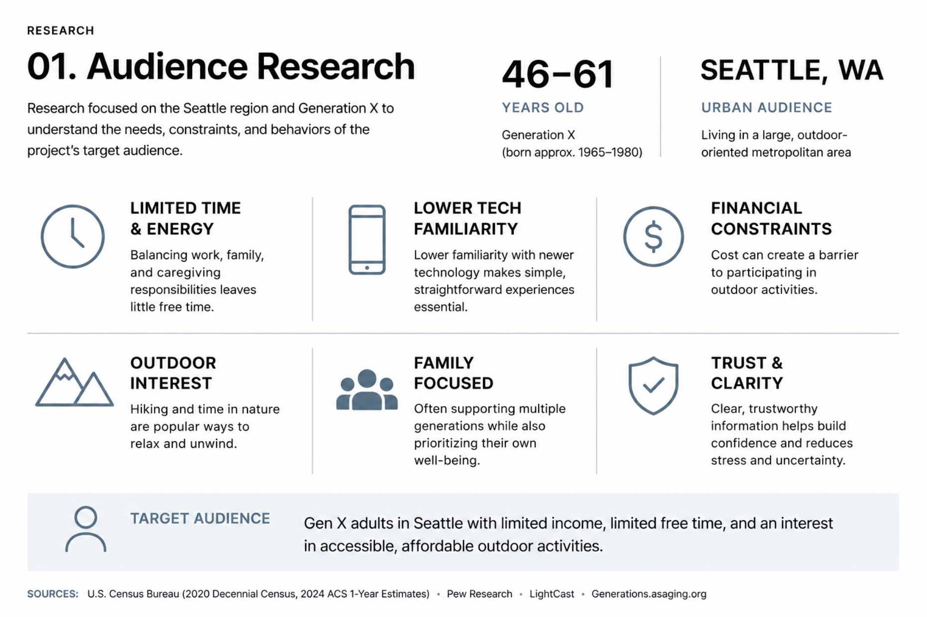
Audience research exploring the demographics, behaviors, and needs of Seattle-based Generation X users.
Problem
How might a nonprofit website make learning about a cause and getting involved feel simple and inviting?
An organization can have a meaningful mission, but that mission becomes harder to support when visitors have to search for important information or aren't sure what to do next. I wanted the website to make Nature for the City's purpose immediately understandable while giving visitors clear pathways to explore its work, learn more, and become involved.
Design process
Organizing the Experience
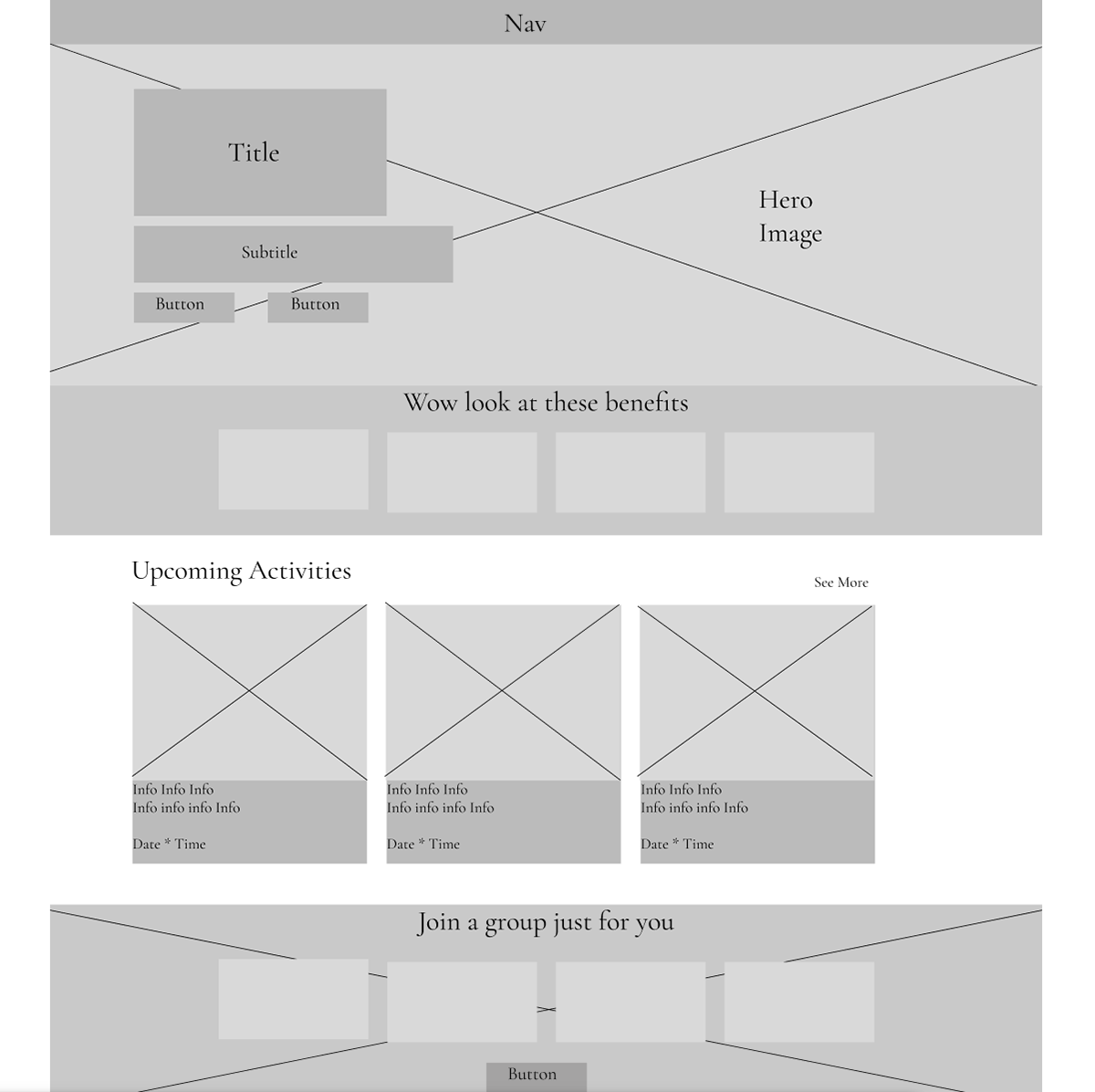
Before focusing on visual design, I considered what information visitors would need most and how that content should be organized across the site. Audience research and early planning helped establish a hierarchy that could introduce the organization's mission without overwhelming visitors with information.
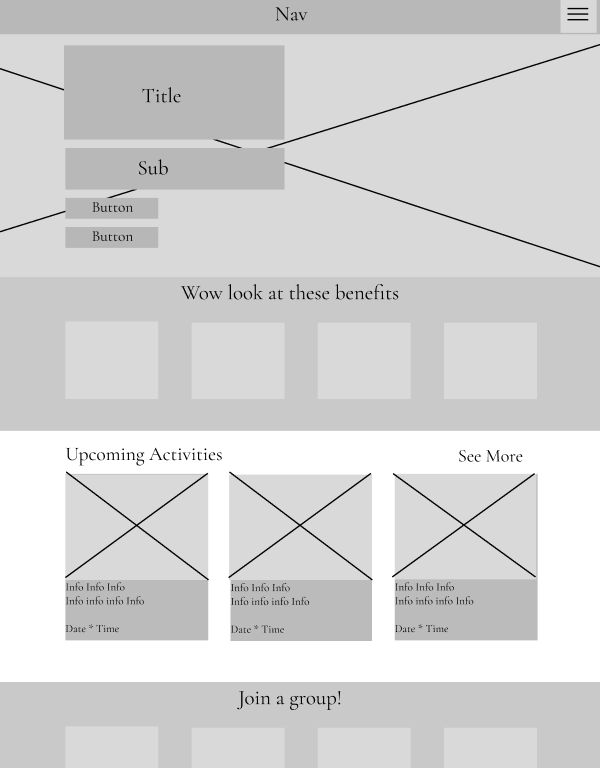
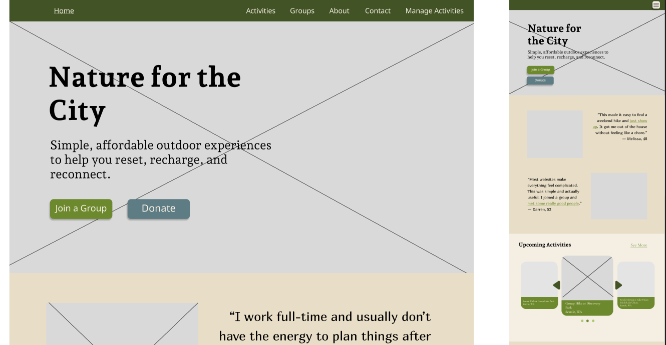
From there, I developed wireframes for both desktop and mobile screens, allowing me to work through content hierarchy, navigation, and responsive behavior before committing to the final visual direction.
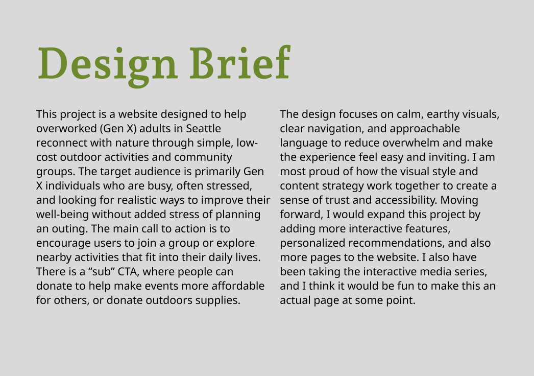
Original Project Design Brief

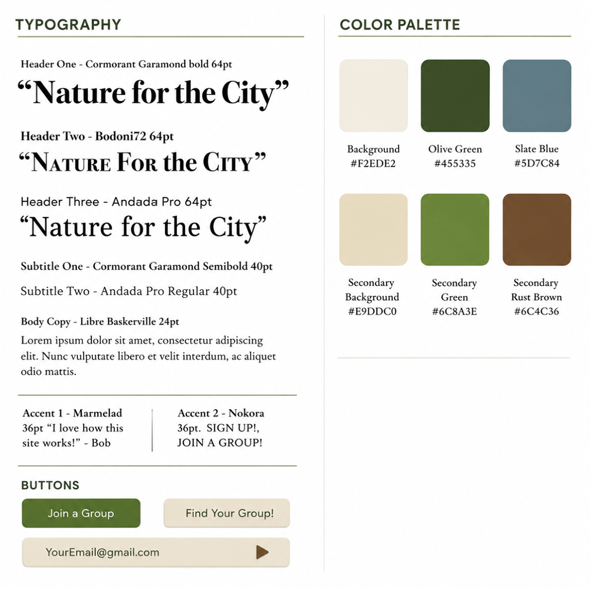
Brand Into the Interface
Once the structure was established, I developed a visual system that could reinforce the organization's environmental focus without competing with its content. Natural imagery, typography, color, and spacing work together to give the site an approachable identity while maintaining clear hierarchy and readability.
Designing Across Screens
Because the website needed to work across different screen sizes, I designed desktop and mobile layouts together rather than treating mobile as a scaled-down version of the desktop site.
Moving between the two required reconsidering spacing, hierarchy, image placement, navigation, and the order in which information appears, while keeping the overall experience visually consistent.
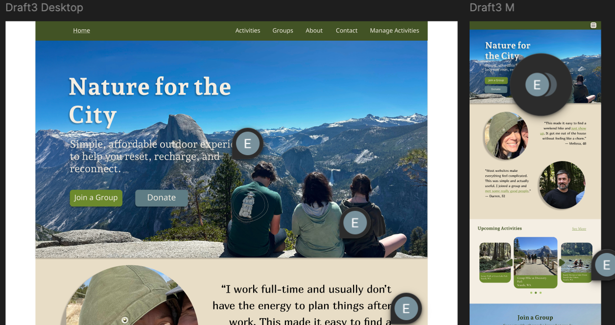
Placeholder
Early homepage concepts with notes identifying design choices to reconsider for the target audience.
Iteration
Designing Through Feedback
Peer critique helped me identify several recurring issues that were difficult to notice after spending so much time with the design myself. Across multiple reviews, the strongest themes were readability, visual hierarchy, navigation, and giving the content more breathing room.
Feedback also helped me reconsider some elements that were unintentionally communicating the wrong thing. Emphasized text within testimonials appeared clickable, primary calls to action needed more visual emphasis, and some areas needed stronger contrast and larger type.
Turning Feedback Into Changes
• More breathing room around headings, images, and sections to improve scan-ability.
• Stronger calls to action so important buttons were easier to identify.
• Clearer navigation through increased size and a more established visual treatment.
• Improved readability through larger text, stronger contrast, and adjustments to the hero.
• Refined testimonials so emphasized text no longer appeared to be clickable.
• Better desktop-to-mobile consistency and refinements to the carousel.
• More breathing room around headings, images, and sections to improve scan-ability.
• Stronger calls to action so important buttons were easier to identify.
• Clearer navigation through increased size and a more established visual treatment.
• Improved readability through larger text, stronger contrast, and adjustments to the hero.
• Refined testimonials so emphasized text no longer appeared to be clickable.
• Better desktop-to-mobile consistency and refinements to the carousel.
Outcomes
Connecting People With a Mission
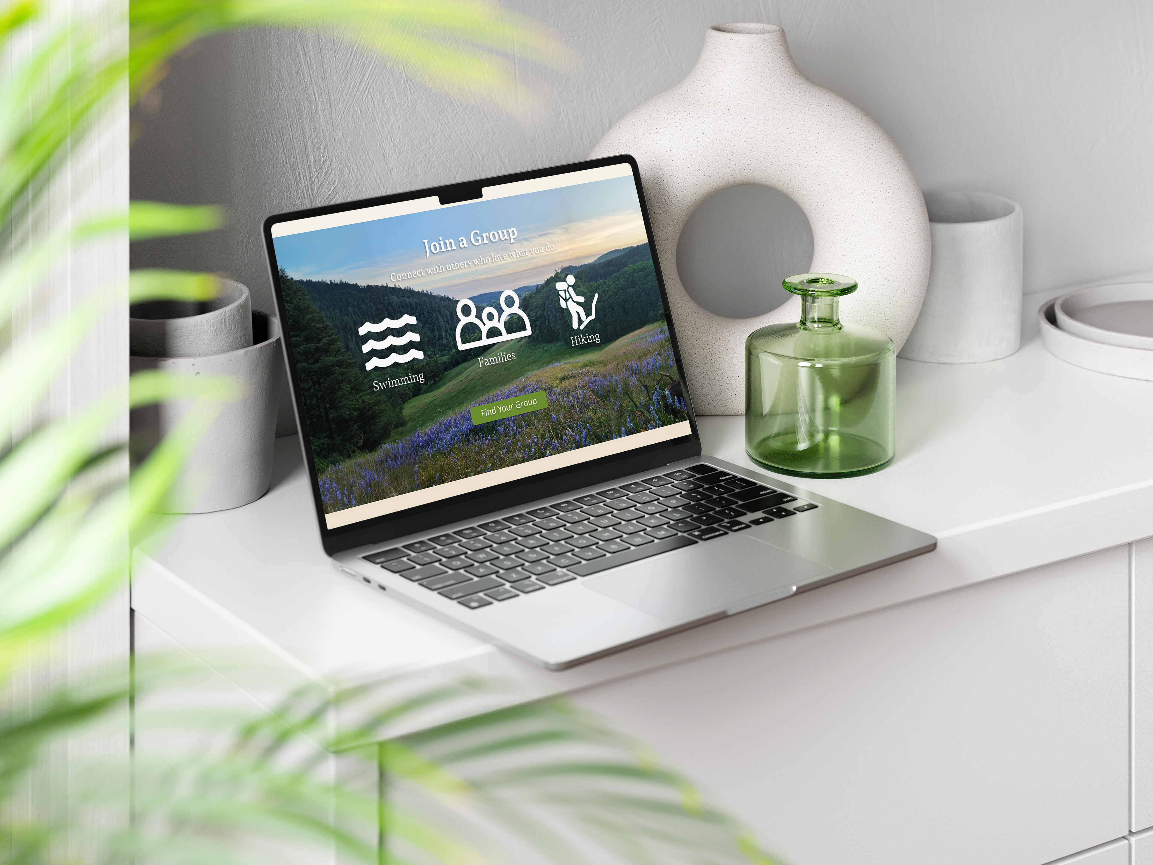
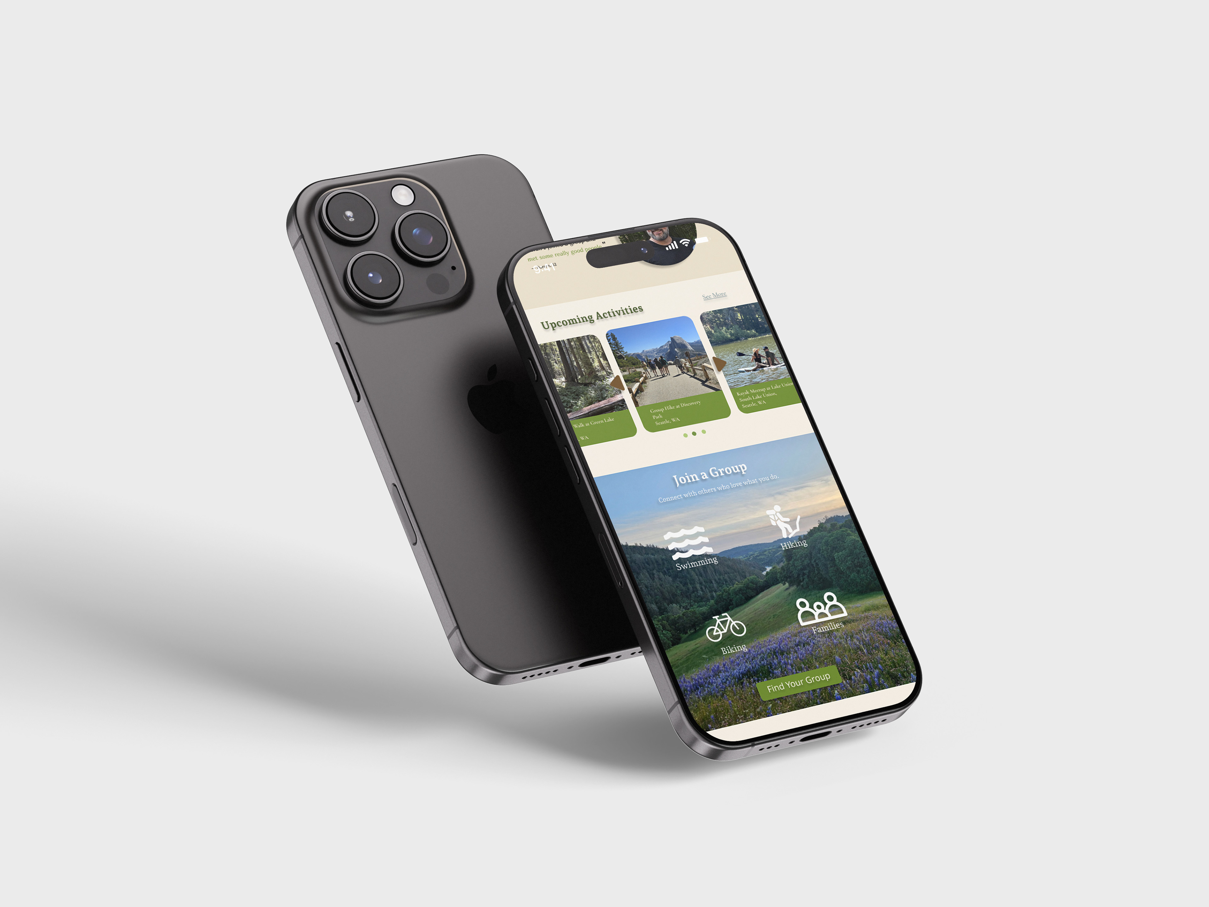
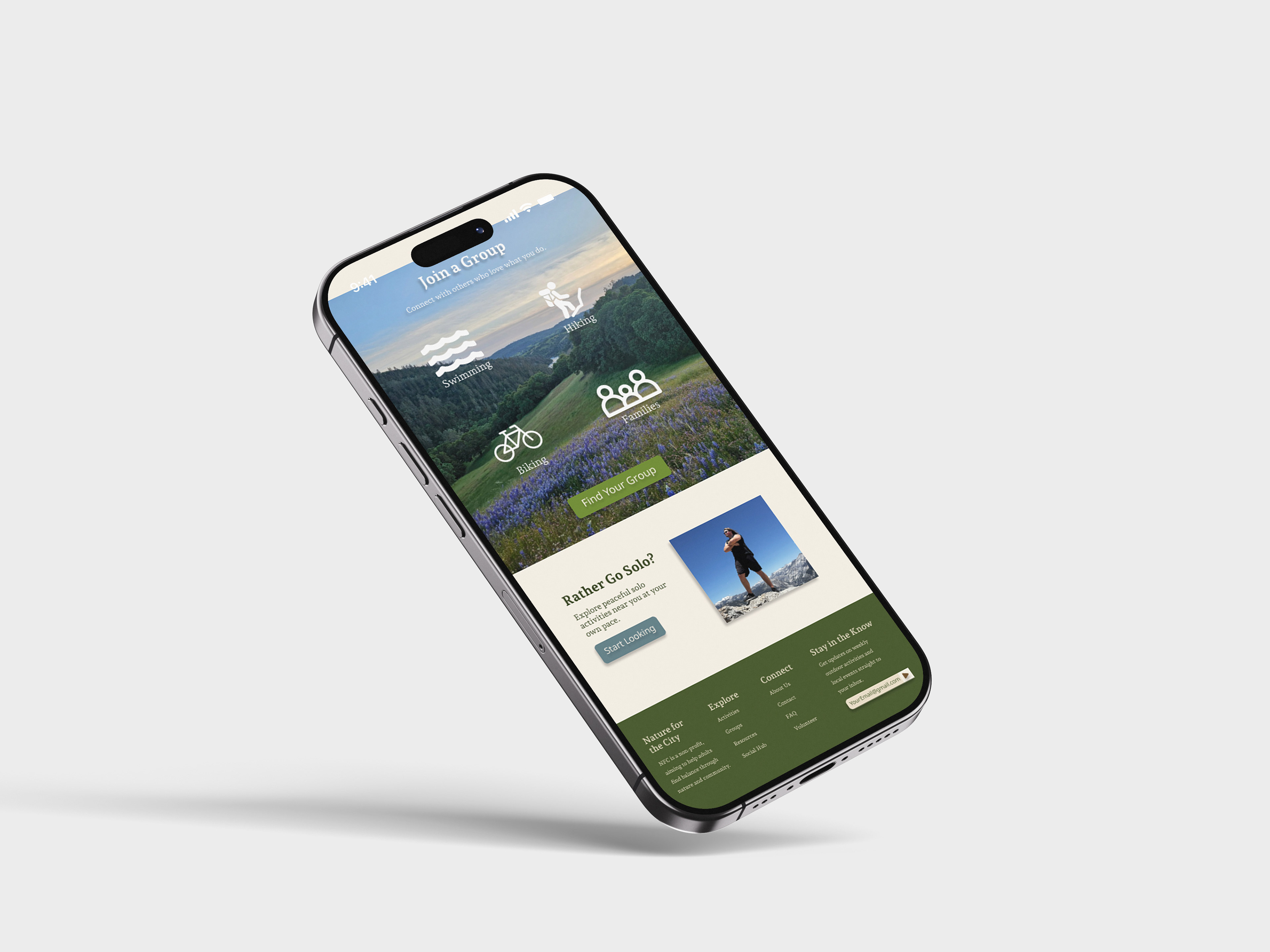
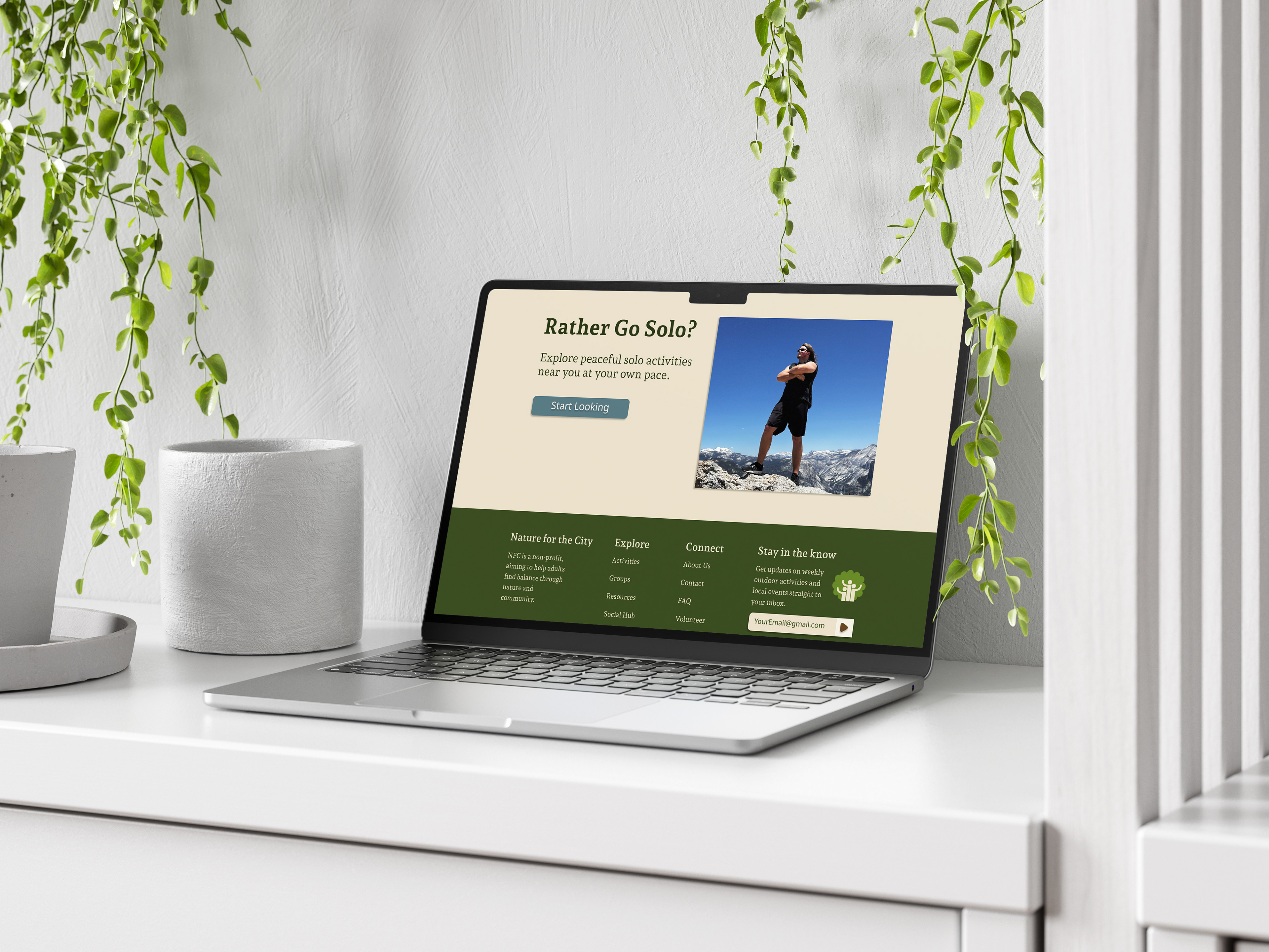
The final Nature for the City concept brings the organization's mission, resources, and opportunities for involvement into one cohesive responsive experience.
Takeaways
What I Learned
Nature for the City helped me understand that designing a website is as much about organizing information as it is about designing individual screens. Decisions about hierarchy, navigation, and content structure shaped the experience before visual styling was ever added.
Designing simultaneously for desktop and mobile also pushed me to think more intentionally about responsive design. Rather than simply shrinking a layout, I learned to reconsider how information should reorganize itself depending on the space available and what a user needs to see first.
Pushing It Further
With more time, I would continue refining the site's responsive behavior, expand its accessibility considerations, and test the experience with a broader range of users, especially those within my assigned focus group. I would also like to develop the site beyond the prototype by coding it into a functional website. Translating the design into code would challenge me to reconsider decisions that work well in Figma but may need to adapt in the browser, while giving me more experience bridging visual design and front-end development.
The project ultimately strengthened my understanding of how research, information architecture, visual identity, and responsive design work together to turn an organization's mission into an approachable experience.