HerHealth
UX/UI Class Capstone Project
UX/UI Class Capstone Project
HerHealth is a mobile health-tracking app designed to help women and individuals with female related health concerns better understand, track, and communicate recurring or unexplained symptoms.
Through simple daily check-ins, symptom logging, visual health summaries, reminders, and appointment preparation tools, HerHealth helps users recognize patterns over time and arrive at healthcare appointments with a clearer record of their experiences and greater confidence communicating their concerns.
Context
Overview
Women can face delayed diagnoses, medical bias, short appointments, and difficulty communicating symptoms that change or occur inconsistently over time.
For this project, I was challenged to identify an equity issue and design a digital mobile app that could meaningfully address it. I focused on the intersection of gender and healthcare accessibility, exploring how design could give patients a better way to document their own experiences and advocate for themselves during medical appointments.
For this project, I was challenged to identify an equity issue and design a digital mobile app that could meaningfully address it. I focused on the intersection of gender and healthcare accessibility, exploring how design could give patients a better way to document their own experiences and advocate for themselves during medical appointments.
Who I Was Designing For
My target audience included women and individuals with female related health concerns who experience recurring or unexplained symptoms—particularly people who have difficulty remembering symptom details between appointments, have limited time or access to care, or have felt dismissed by healthcare providers.
Problem
How might we make changing, recurring symptoms easier to remember, understand, and communicate?
Symptoms can be difficult to remember and recognize between appointments, especially when limited appointment time makes communicating a complex health history challenging. HerHealth turns small pieces of information collected over time into a clearer picture of a user’s health, making it easier to document, understand, and communicate their experiences.
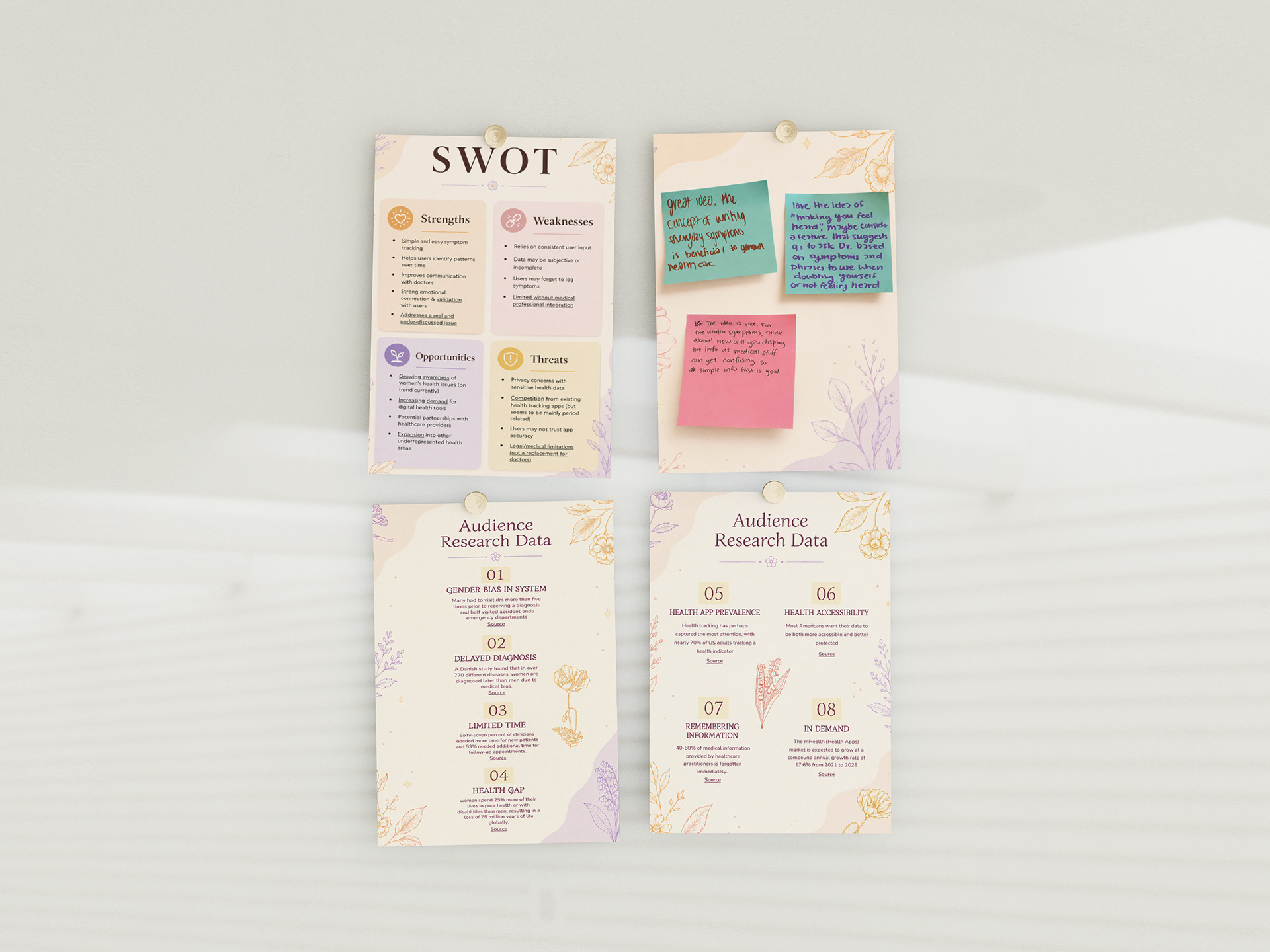
Early research, including a SWOT analysis, peer feedback, and online research, was compiled into presentation slides for class critique.
Understanding the problem
Research
Before designing the app, I researched women's experiences within healthcare, medical bias and accessibility, health-tracking behaviors, and existing digital health products.
Several Themes Appeared
•Women experience delayed diagnoses and require multiple visits before receiving answers.
•Short medical appointments make it difficult to communicate complex or changing symptoms.
•Patients forget important medical information and symptom details between appointments.
•Digital health tracking is already familiar to many users, creating an opportunity to make personal health information easier to document and understand.
Diving Deeper
Turning Research Into a User
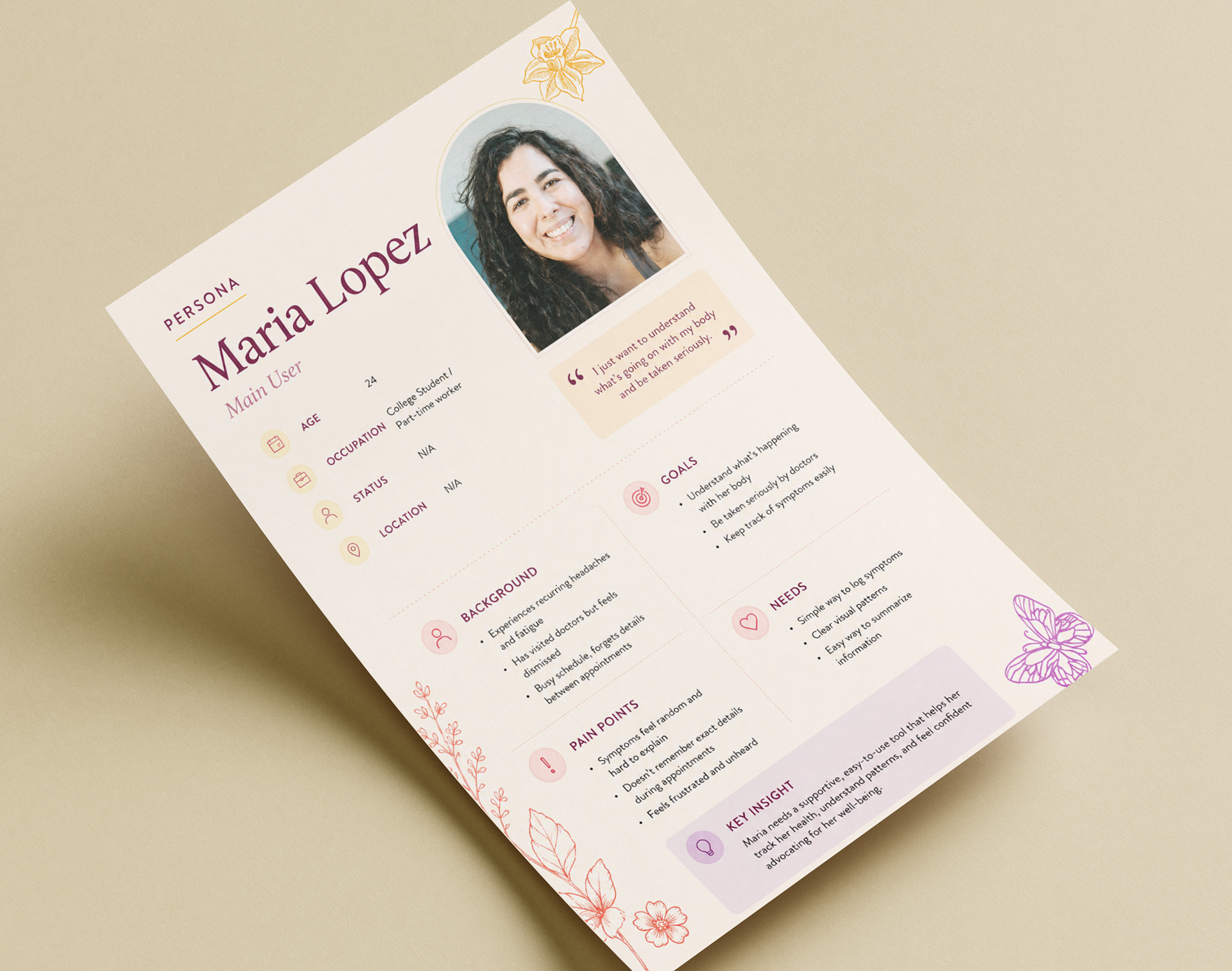
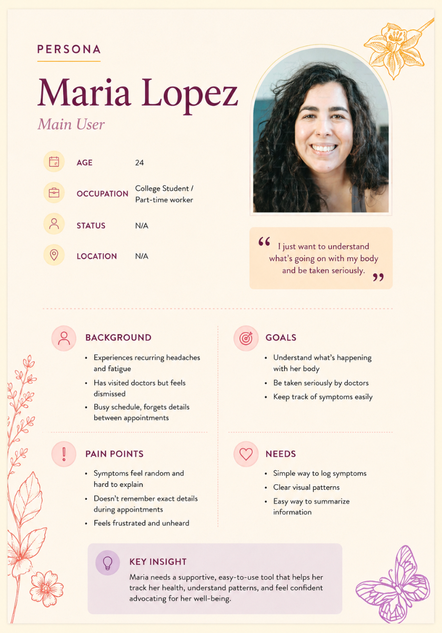
I used these findings to develop the persona of Maria Lopez, a 24-year-old college student balancing a busy schedule with recurring symptoms. Maria wants to better understand her health and feel taken seriously when seeking care, but struggles to remember when symptoms occur and how they change over time.
Her needs helped establish three priorities for HerHealth:
•Make logging simple. Tracking should take only a few moments.
•Make patterns visible. Individual entries should become useful information over time.
•Make information easier to communicate. Users should be able to reference their history when preparing for healthcare appointments.
Design
Daily Check-In
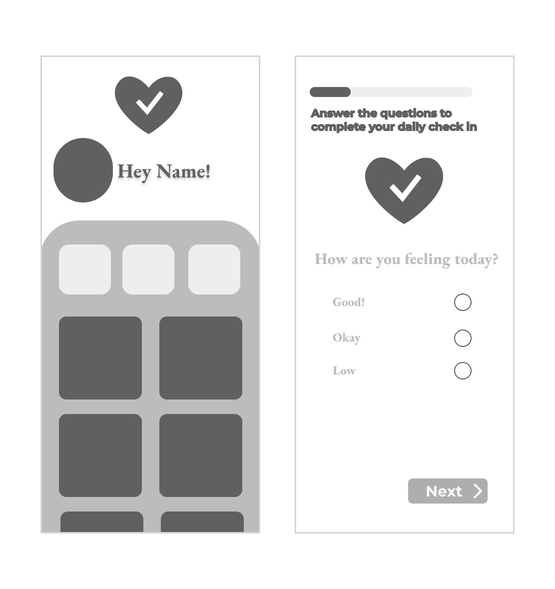
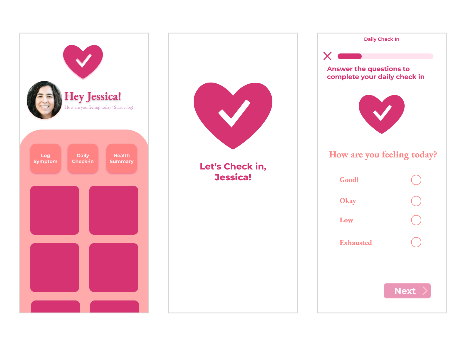
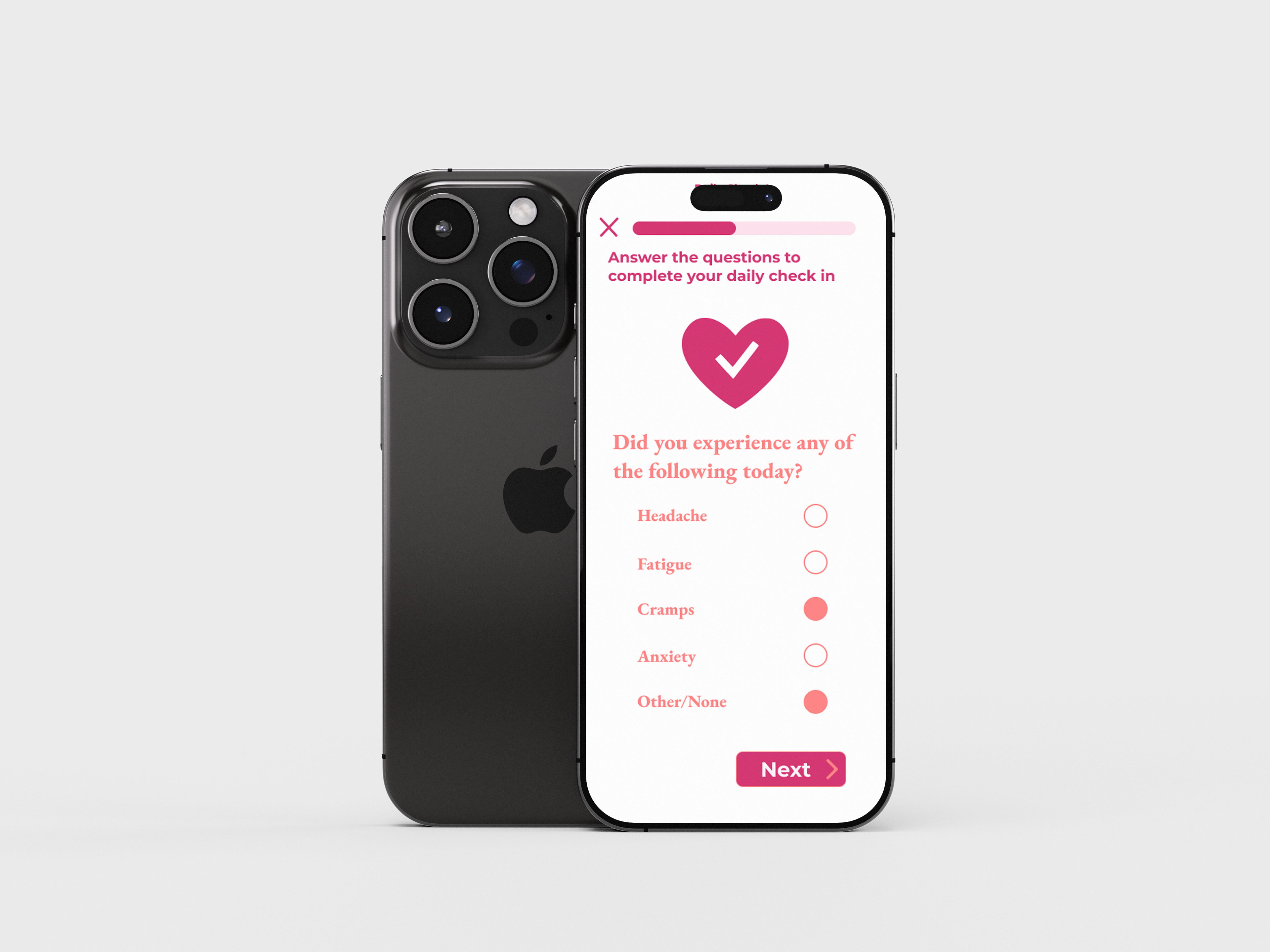
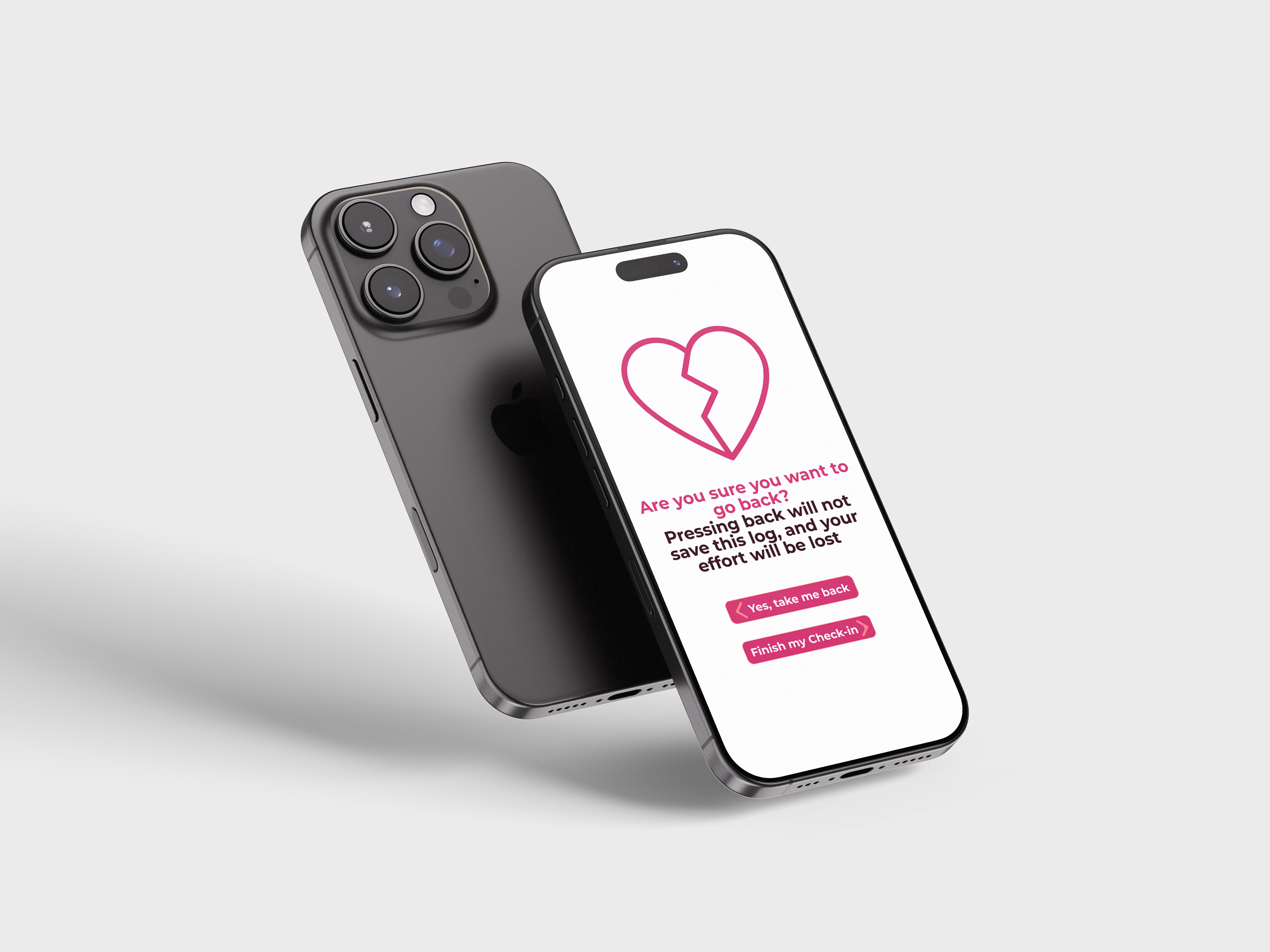
Consistent tracking is only useful if people are willing to keep doing it. Instead of presenting users with one long health form, I designed the daily check-in as a guided sequence of simple questions covering topics like pain, sleep, energy, mood, medication, and symptoms, reducing the amount of cognitive load that users would have to process at once while still collecting enough data to reveal meaningful patterns over time.
Design
Home Page
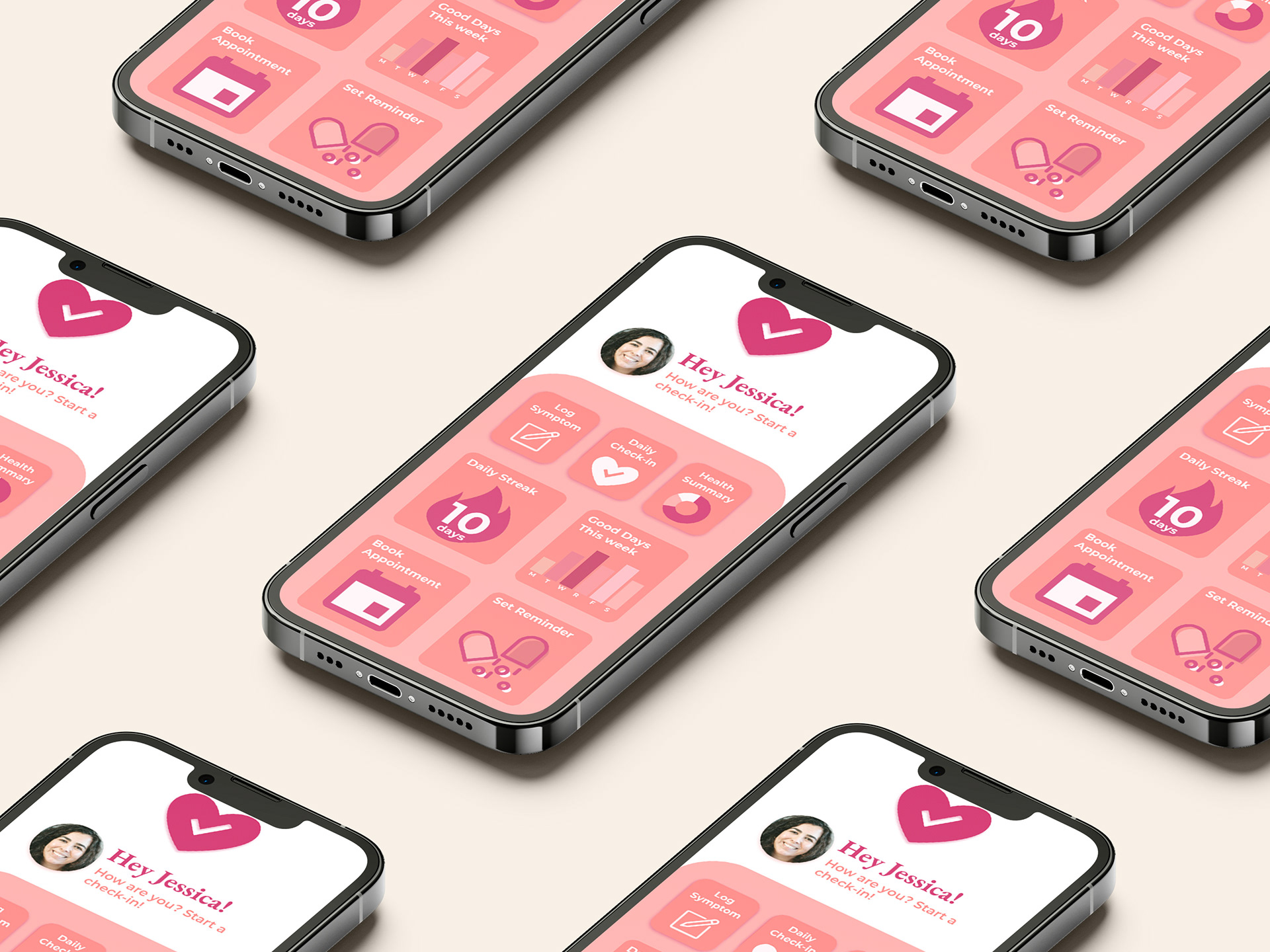
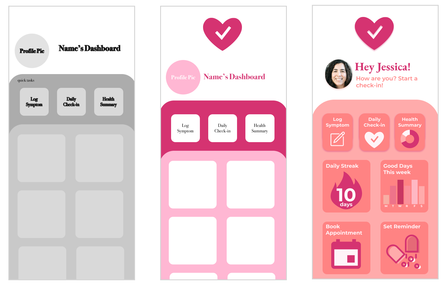
The dashboard needed to do more than store information, it needed to make returning to the app feel useful. I organized the experience around common actions like logging symptoms, completing daily check-ins, reviewing health summaries, setting reminders, and preparing for appointments, while visual summaries, daily streaks, and “good day” tracking give users quick feedback without requiring them to interpret a dense medical record.
Iteration
Putting the Prototype to the Test
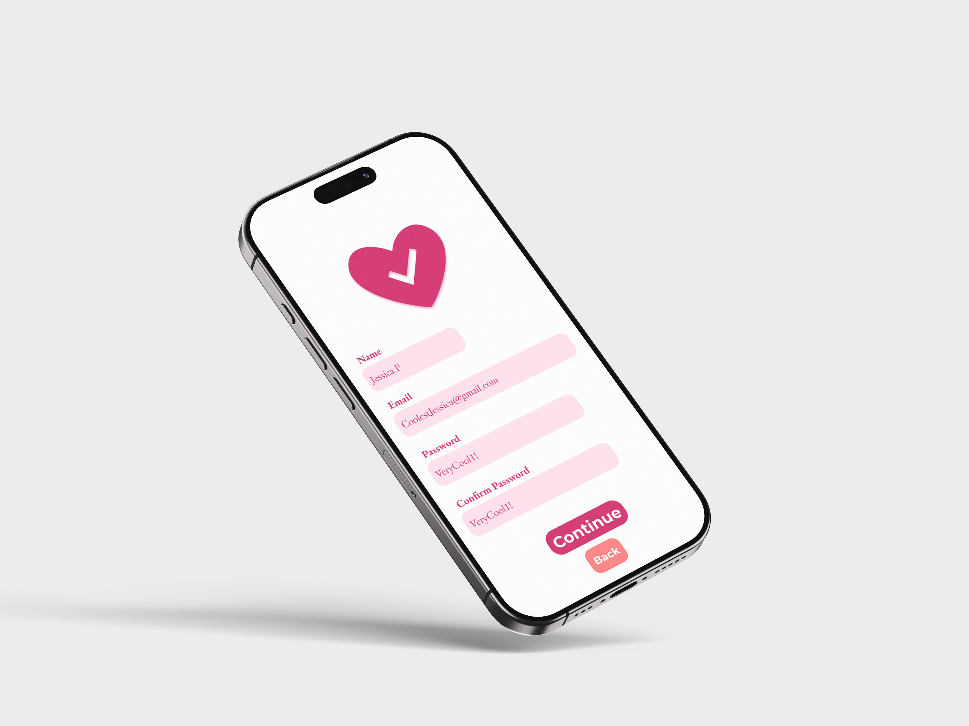
After developing an interactive prototype, I conducted usability testing with five college-aged, female-identifying participants who tested the app’s three primary tasks: daily check-ins, health summaries, and symptom logging, along with supporting interactions like account creation, login, and dashboard navigation.
What Testing Revealed
Testing revealed several recurring usability issues and opportunities for improvement:
• Multiple users were confused by the final step of the daily check-in and were unsure how to complete it.
•Several users experienced readability issues, particularly with small text.
•Important actions, including password recovery and navigation buttons, needed stronger visual emphasis.
•Some terminology and controls could be made more intuitive and approachable.
•Users responded positively to the color palette, overall navigation, confirmation feedback, and guided check-in experience.
• Multiple users were confused by the final step of the daily check-in and were unsure how to complete it.
•Several users experienced readability issues, particularly with small text.
•Important actions, including password recovery and navigation buttons, needed stronger visual emphasis.
•Some terminology and controls could be made more intuitive and approachable.
•Users responded positively to the color palette, overall navigation, confirmation feedback, and guided check-in experience.
Outcomes
A Clearer Health Picture
The final HerHealth prototype brings symptom tracking, guided daily check-ins, health summaries, reminders, and appointment preparation into one approachable mobile experience.
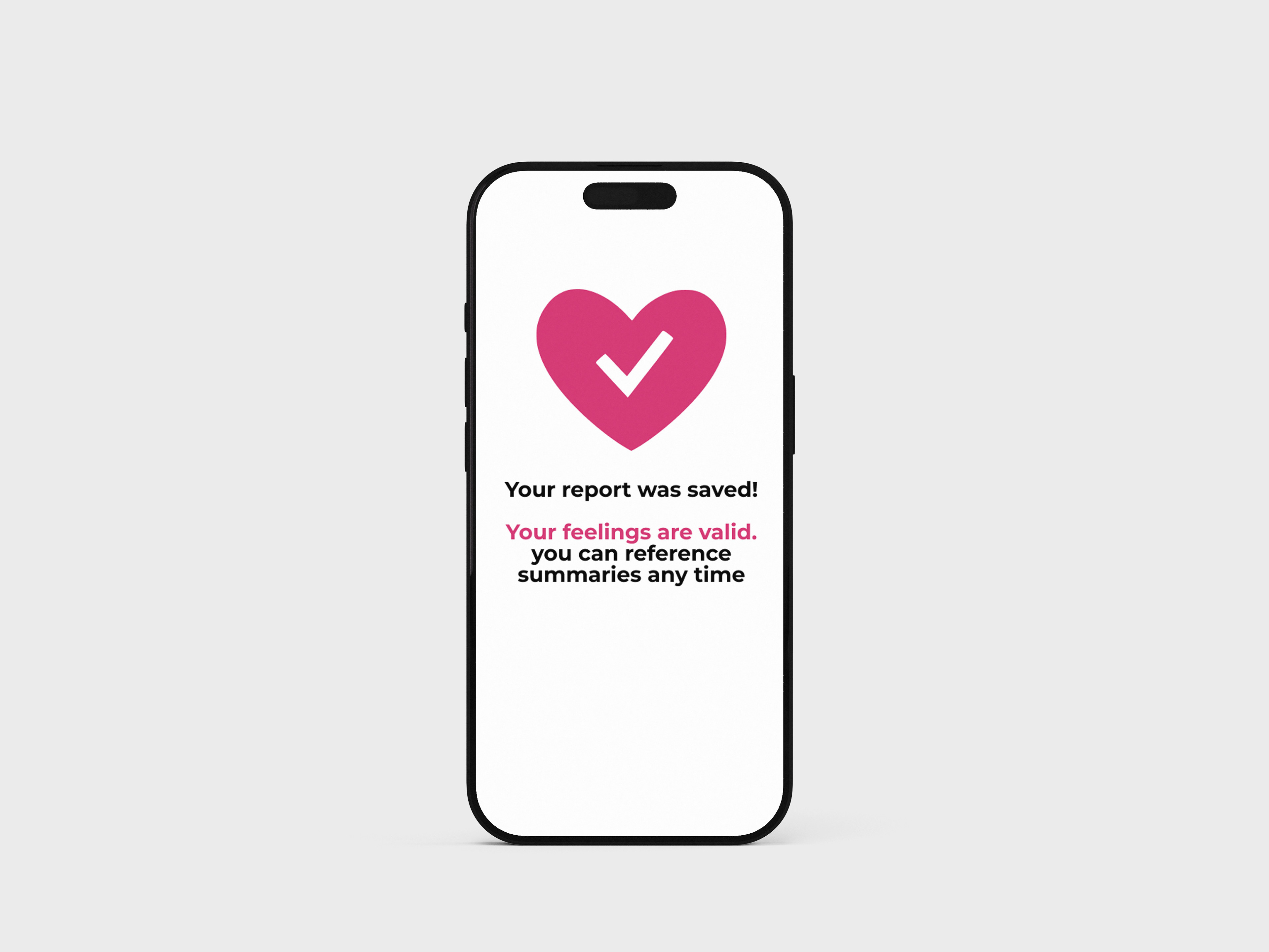
Rather than providing diagnoses, HerHealth gives users a way to build a clearer record of their own experiences, helping scattered daily symptoms become information they can recognize, remember, and communicate.
Takeaways
What I Learned
HerHealth taught me that designing an interface isn't just about determining what information belongs on a screen, it's about deciding what information a user needs at that moment and how much complexity they should have to process at once.
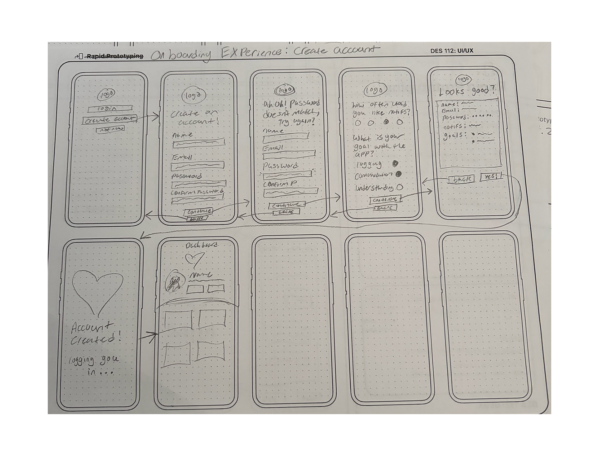
Moving from research to user flows, wireframes, prototyping, and usability testing showed me how much a design can change once someone else actually uses it. Small decisions that felt obvious while designing, such as button hierarchy or how a check-in ends, were not always obvious to users. This project strengthened my understanding of user-centered design and taught me to treat feedback and iteration as an essential part of the design process rather than something that happens after a design is “finished.”
Pushing It Further
With more time, I would love to expand HerHealth through broader usability and accessibility testing, stronger healthcare-provider integration, and more personalized insights based on tracked information.
The project ultimately showed me how thoughtful interaction design can help make complicated information feel more approachable, and how design can support users in communicating experiences that may otherwise be difficult to document.