RHYTHM
An Editorial Exploration of a Single Idea
An Editorial Exploration of a Single Idea
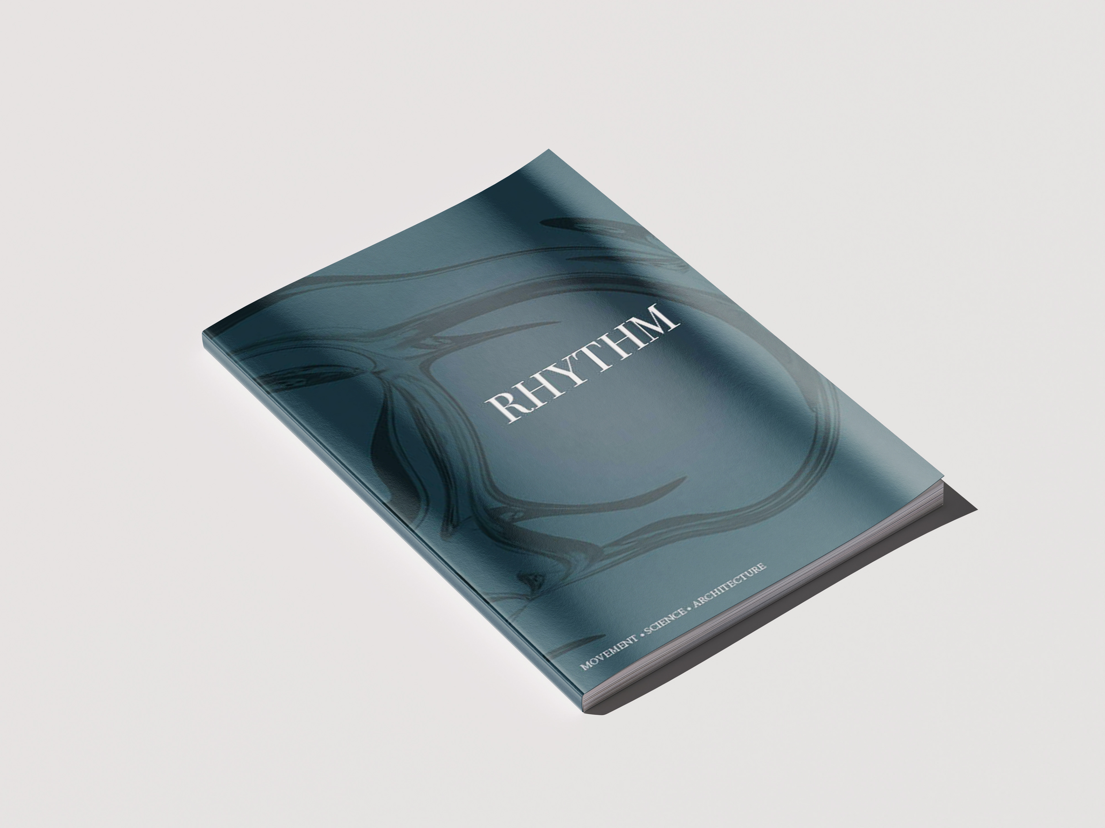
Rhythm is an editorial publication exploring how one concept can appear across seemingly unrelated subjects, from movement and the human body to architecture, science, language, and music.
Rather than defining rhythm in a single way, the publication uses typography, imagery, composition, repetition, and pacing to visually interpret how rhythm changes across each subject. While every spread was designed to have its own character, the publication maintains a consistent visual system that connects them as parts of one larger idea.
Context
Finding a Concept With Range
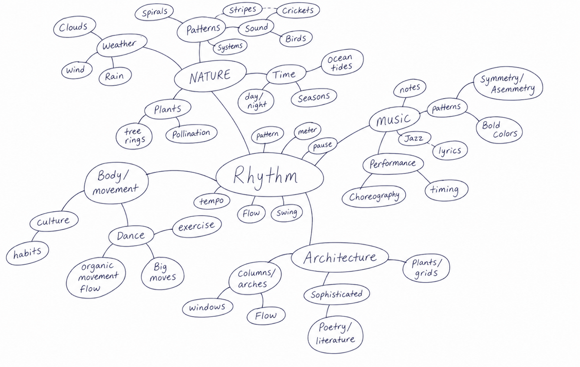
The project began with a single word. Each student selected a concept broad enough to research, interpret, and communicate through an entire publication. I chose rhythm because it could describe far more than music: rhythm exists in movement, language, biological processes, architecture, patterns, and everyday life.
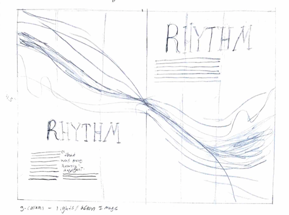
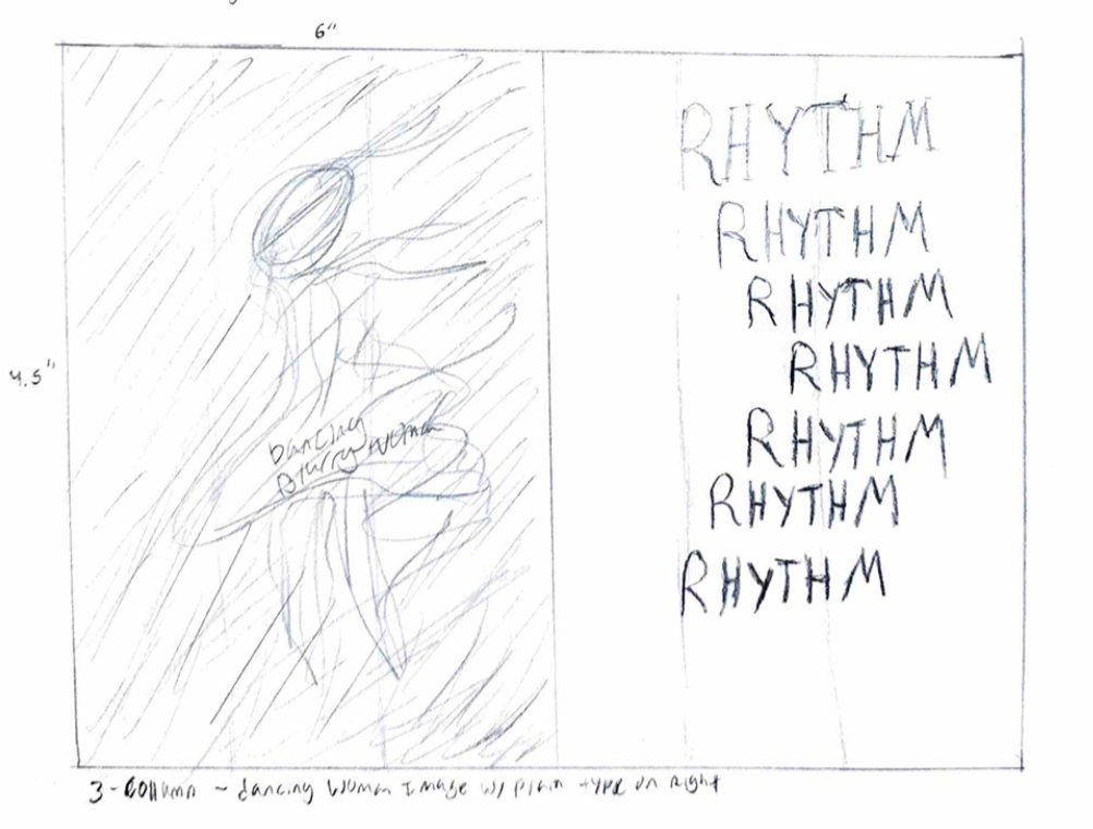
I began by mapping those connections through brainstorming, research, and a mind map. From there, I collected writing and imagery that approached rhythm from different perspectives and began considering how the design of each spread could reflect the rhythm being discussed.
Challenge
How do you visually represent something that can look completely different depending on its context?
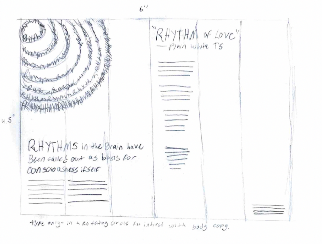
The challenge was to give each interpretation of rhythm its own visual character without making the publication feel like a collection of unrelated designs. I needed to create enough variation for each spread to express its subject while maintaining consistency through color, typography, image treatment, hierarchy, and recurring layout decisions.
That balance between variation and repetition became part of the concept itself: the publication needed to use rhythm while explaining it.
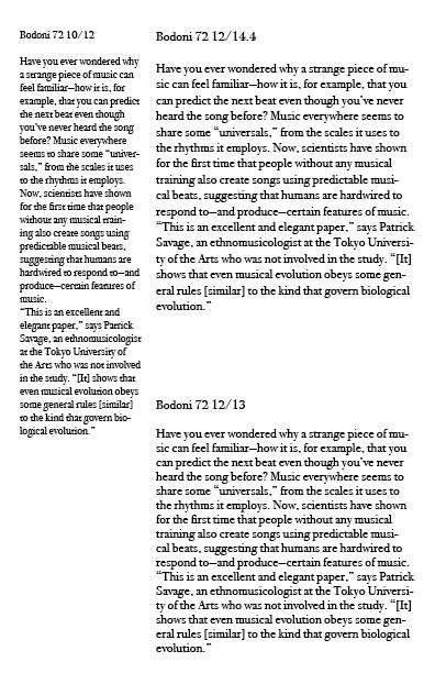
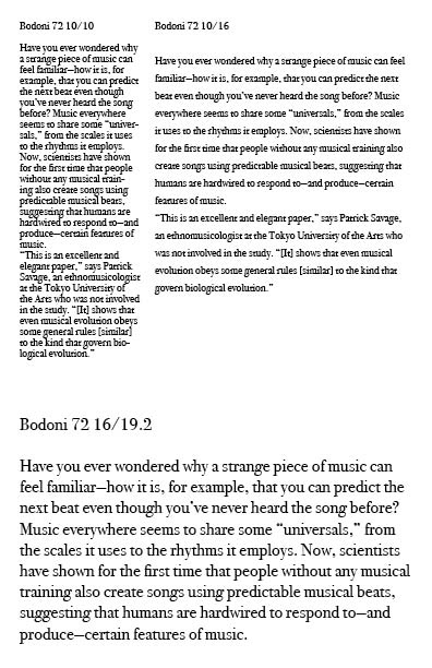
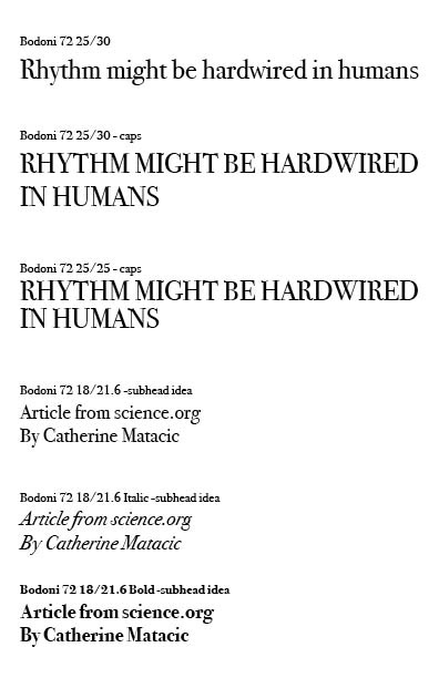
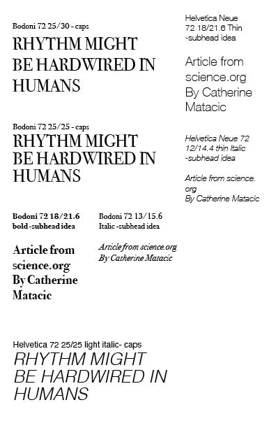
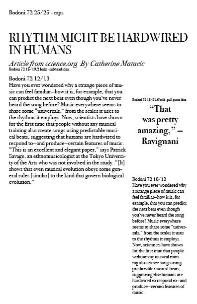
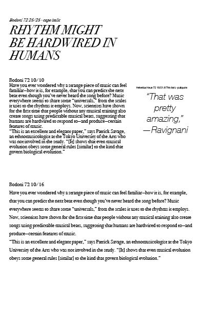
Early type studies testing Bodoni and other fonts across headlines, subheads, pull quotes, and body copy.
Design
01 / Rhythm Through Movement
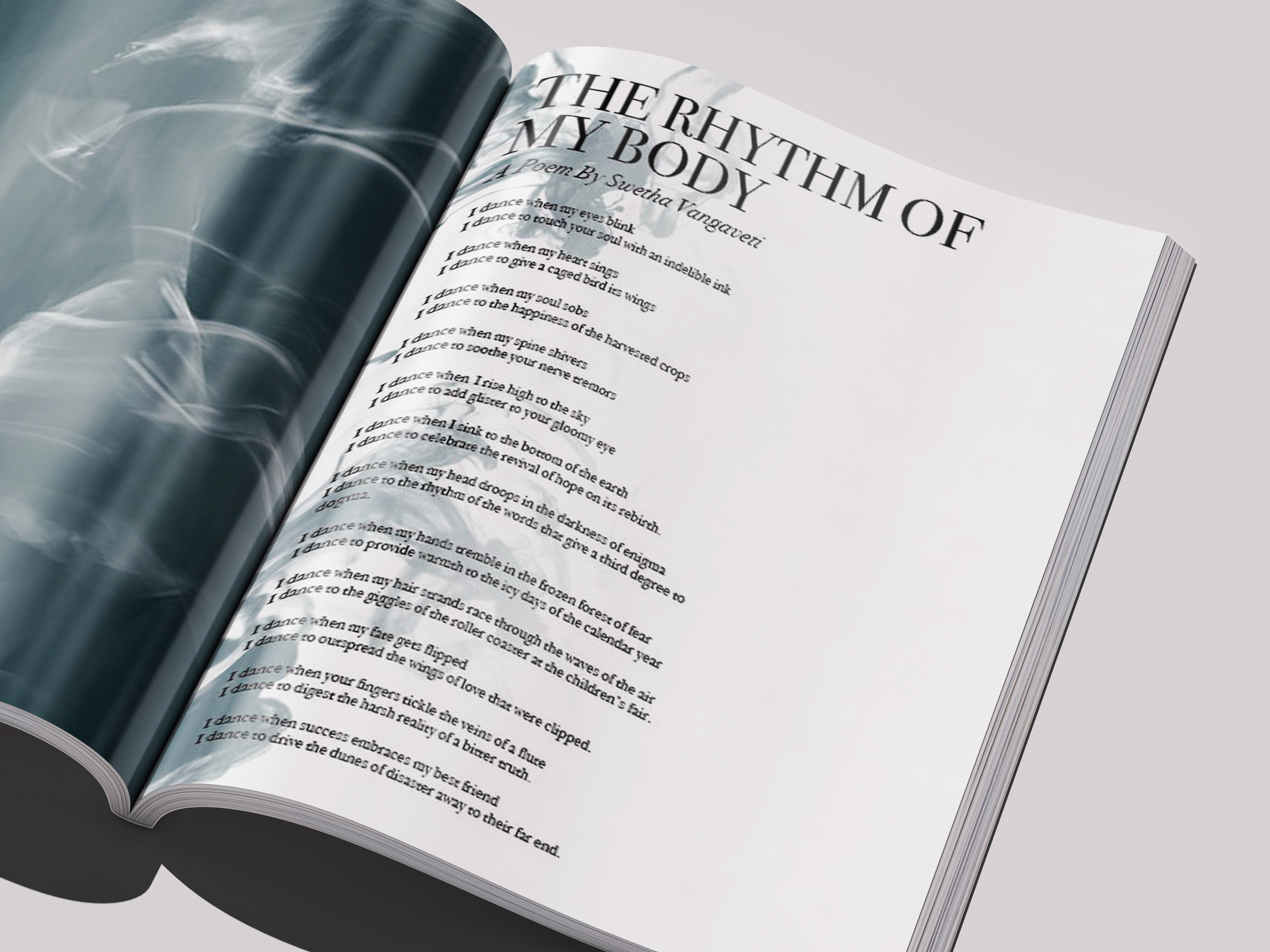
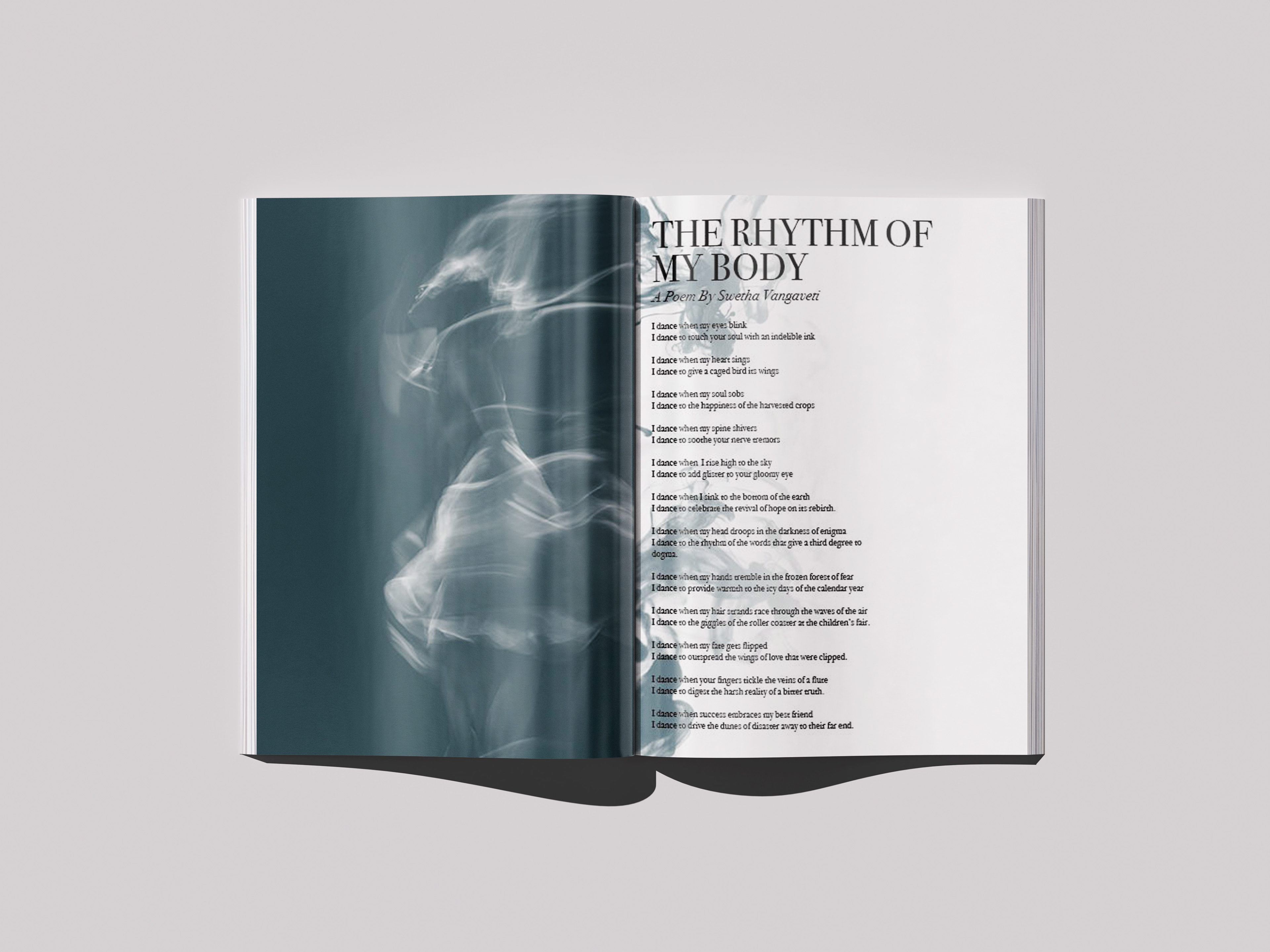
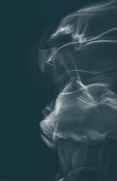
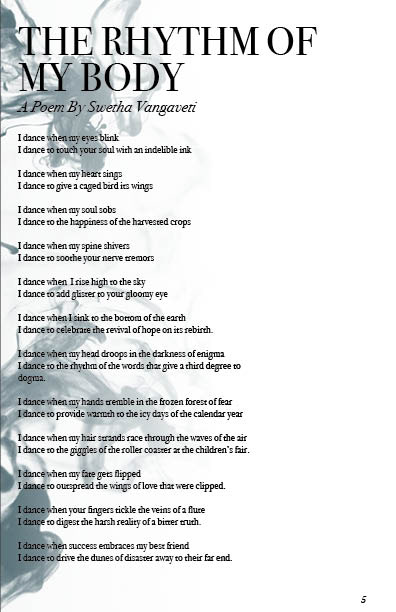
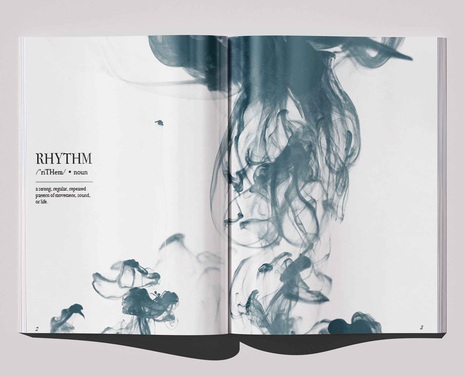
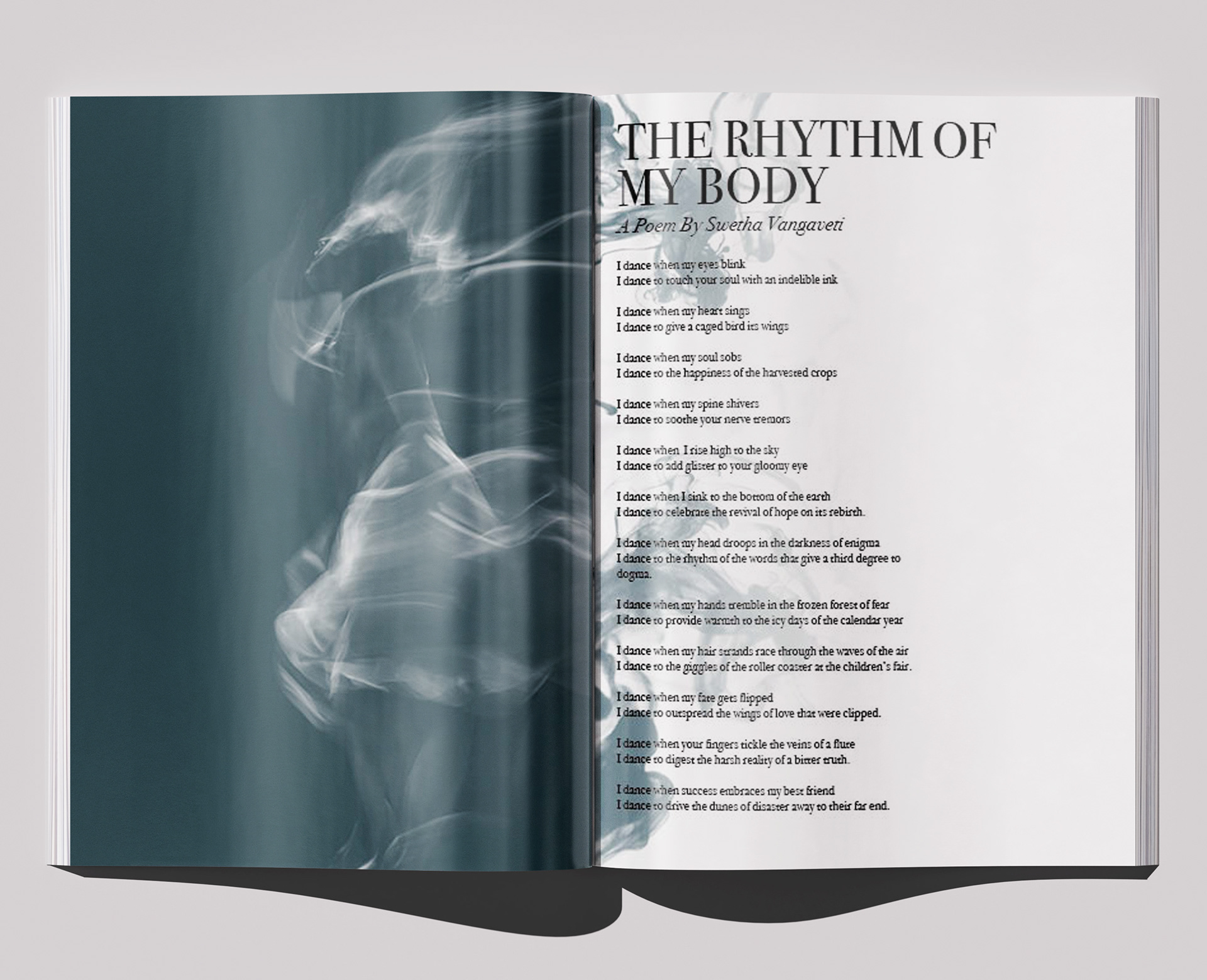
For the opening section, I explored rhythm through the movement of the human body. Motion-blurred photography allowed a single figure to appear almost as a sequence of movements rather than a frozen moment, visually reinforcing the repetition and flow described within the accompanying poem.
The spread uses large areas of deep teal alongside open white space, creating a strong sense of movement across the composition. Typography reinforces this rhythm, with text streaming alongside the smoke and using its placement and direction to visually embody movement across the page.
Design
02 / Rhythm Through Structure
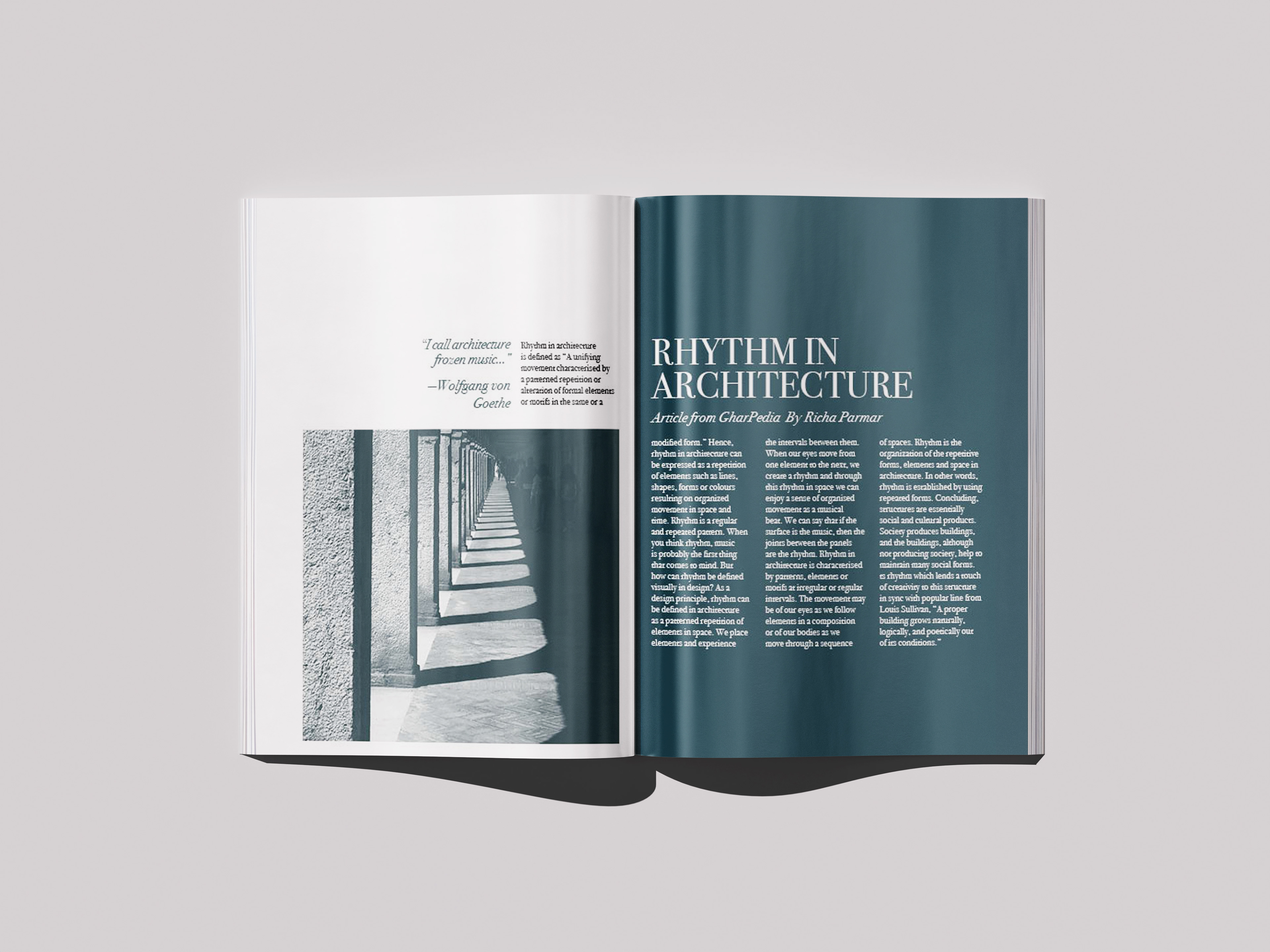
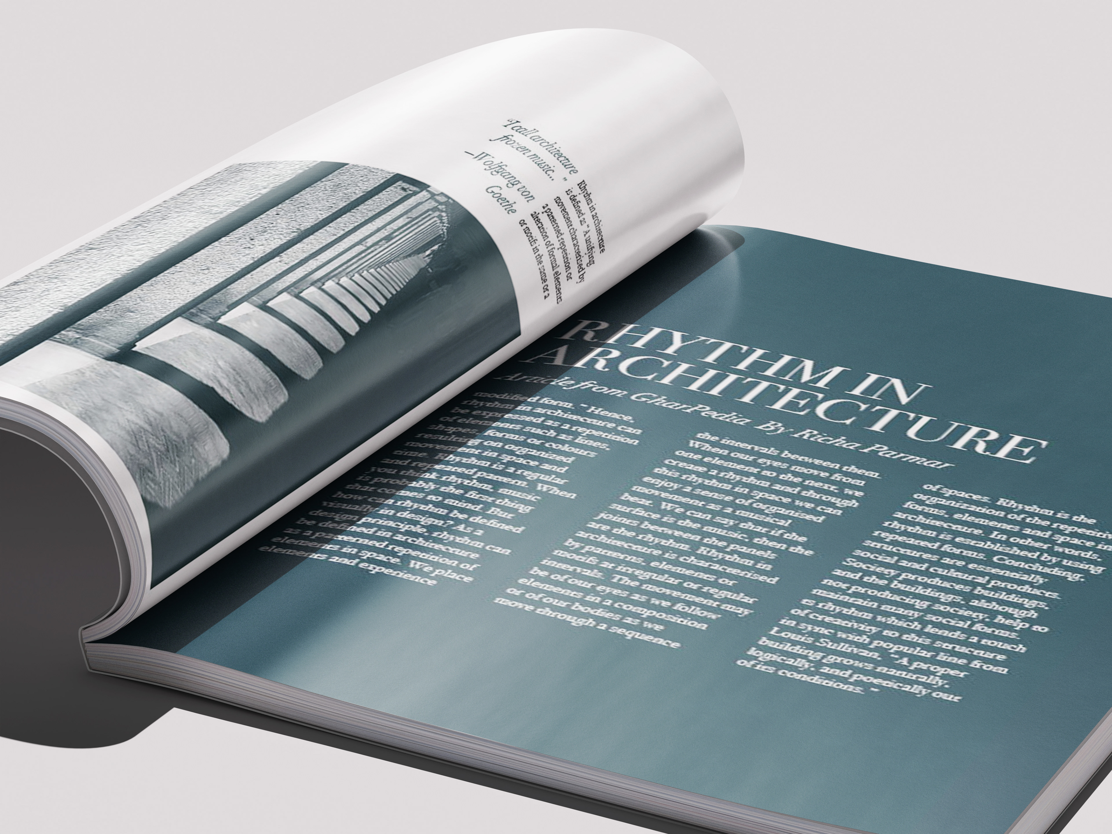
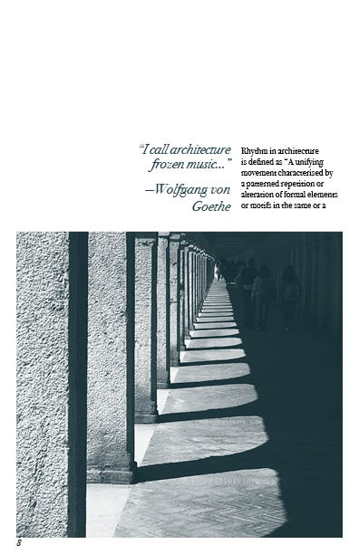
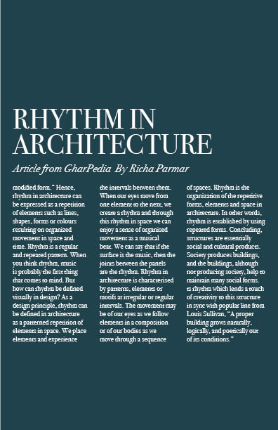
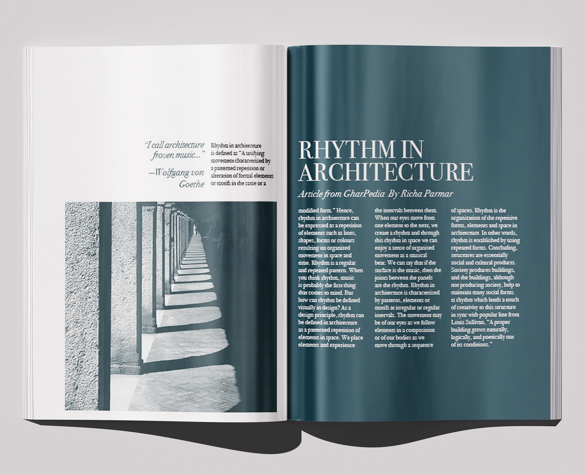
Architecture offered a very different interpretation of the same concept. Rather than showing physical motion, I focused on repetition, spacing, pattern, and progression within built environments.
The repeating columns and shadows create a natural visual beat across the photograph, while the editorial layout mirrors that structure through columns of text and repeated alignments. This allowed the spread to communicate rhythm through organization rather than movement.
Designing a System
Connecting Different Rhythms
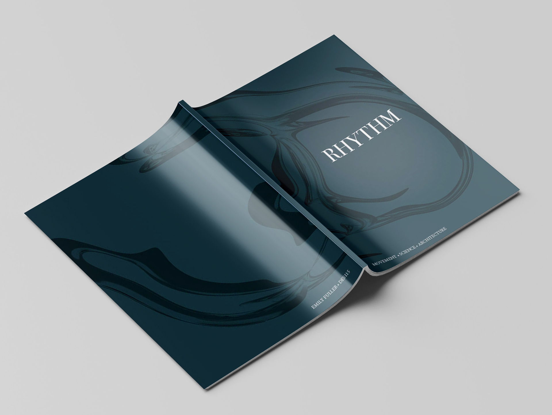
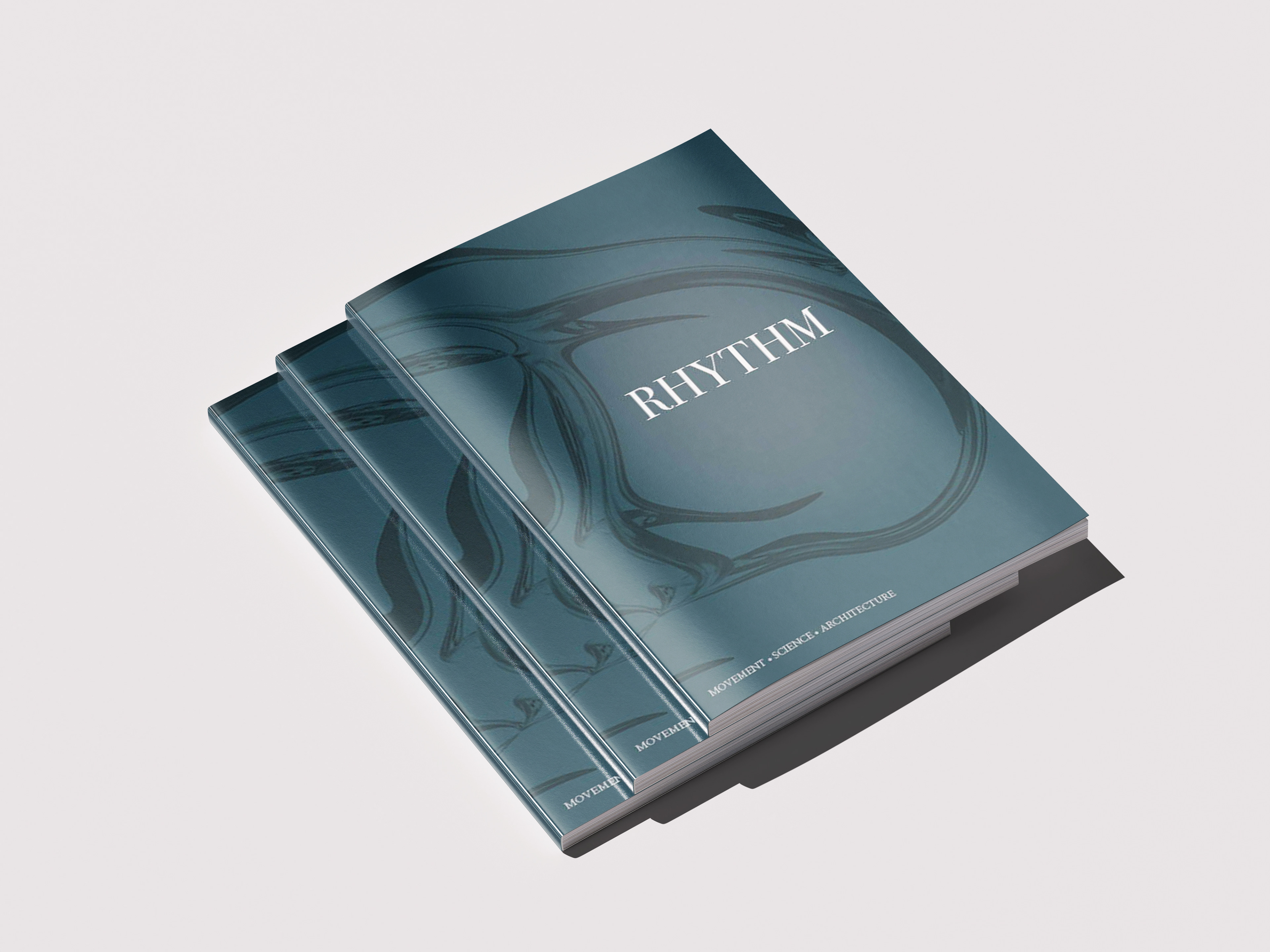
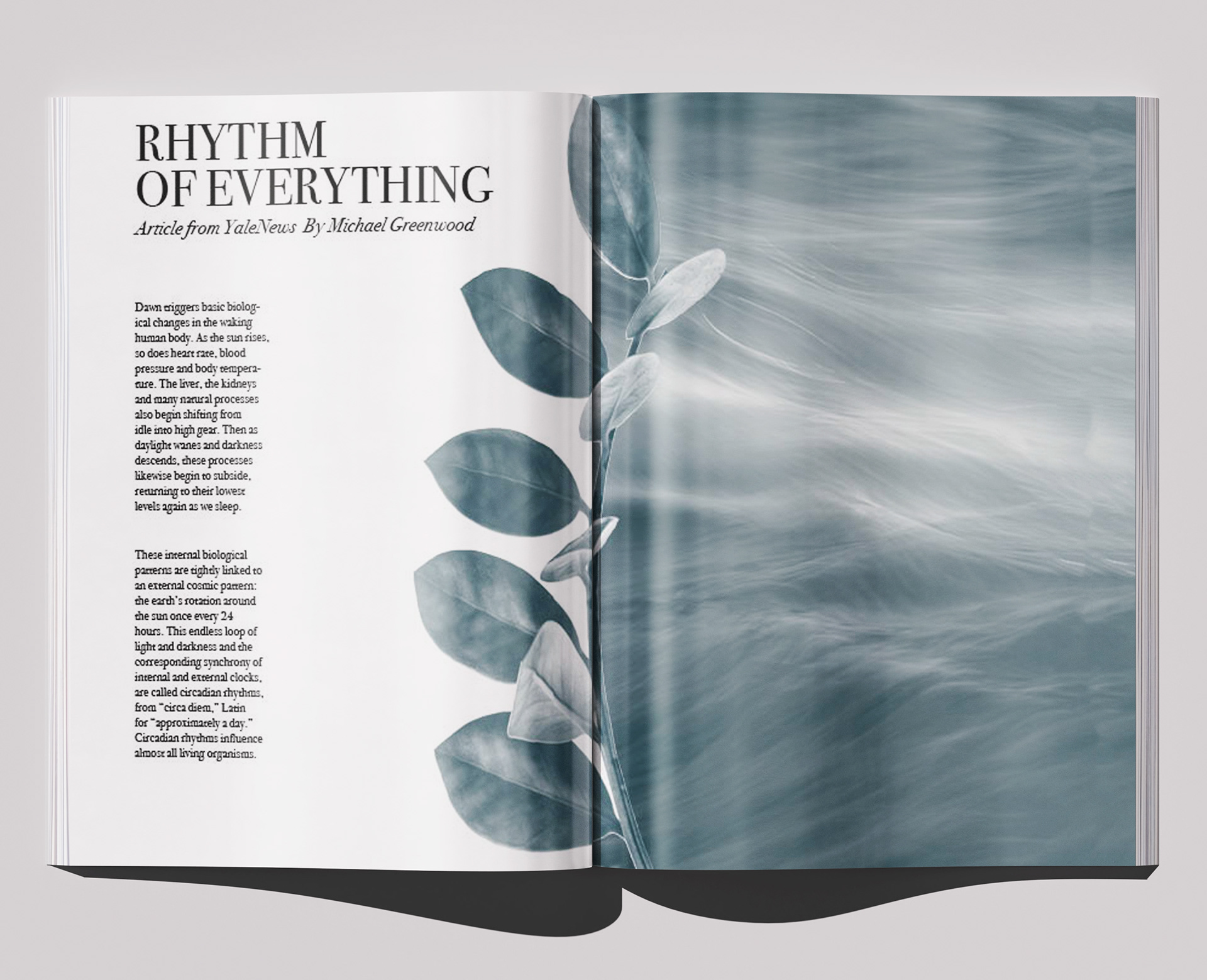
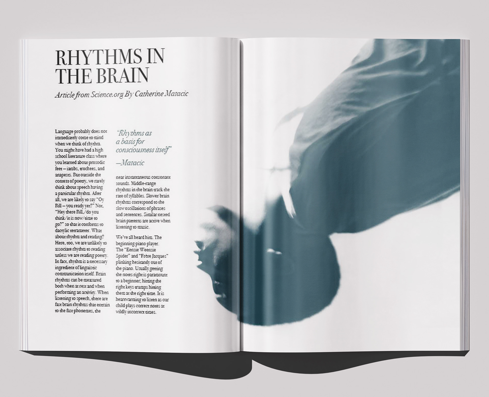
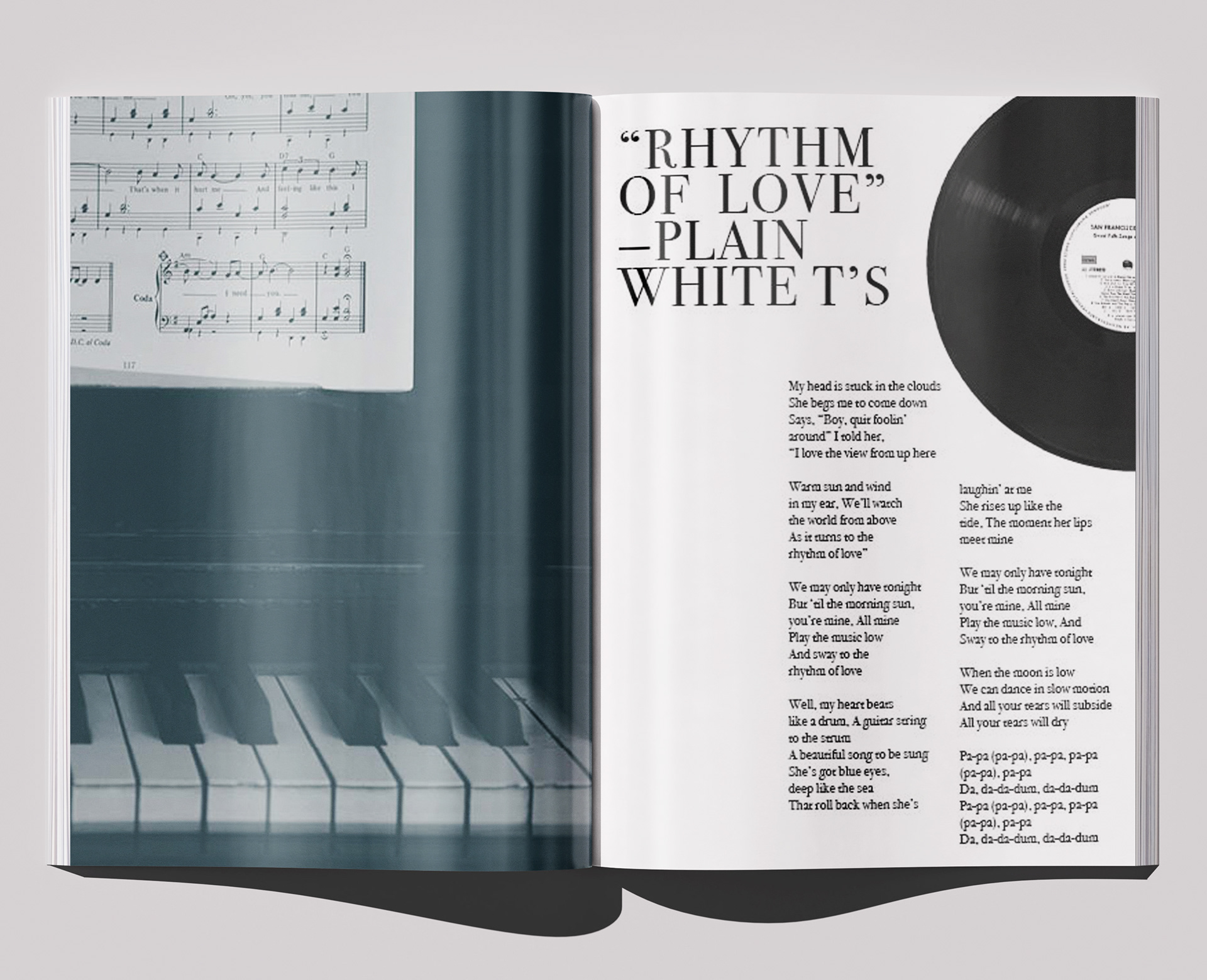
Although each section interprets rhythm differently, I developed a consistent editorial language to hold the publication together. A limited teal, white, and black palette, recurring, simple typography, photographic treatments, and shifts between dense and open compositions create continuity while still allowing individual spreads to change with their subject.
Instead of making every page follow the same template, I treated the publication more like a sequence: repetition establishes familiarity, while changes in scale, imagery, and composition create variation.
Takeaways
Designing Beyond Individual Pages
Rhythm taught me to think about publication design as more than a collection of individual spreads. Every page needed to work on its own, but it also needed to contribute to the pacing and identity of the publication as a whole.
The project strengthened my understanding of editorial hierarchy, typography, image treatment, pacing, and visual systems, while challenging me to translate an abstract concept into multiple visual forms. It also made me more comfortable allowing different pages to behave differently without losing the larger design language connecting them.
Looking Forward
I really enjoyed working on Rhythm and discovering how much I liked the process of publication and editorial design. Bringing together typography, imagery, layout, and storytelling across an entire publication gave me the opportunity to think both creatively and systematically. I would love the chance to work on more editorial projects in the future and continue exploring how a strong visual system can connect different ideas into one cohesive experience.